![]()
ref
https://guebin.github.io/DV2022/posts/2022-11-14-11wk-1.html#data2-핸드폰점유율
import
data: 핸드폰점유율
df = pd.read_csv('https://raw.githubusercontent.com/kalilurrahman/datasets/main/mobilephonemktshare2020.csv')
df| Date | Samsung | Apple | Huawei | Xiaomi | Oppo | Mobicel | Motorola | LG | Others | Realme | Nokia | Lenovo | OnePlus | Sony | Asus | ||
|---|---|---|---|---|---|---|---|---|---|---|---|---|---|---|---|---|---|
| 0 | 2019-10 | 31.49 | 22.09 | 10.02 | 7.79 | 4.10 | 3.15 | 2.41 | 2.40 | 9.51 | 0.54 | 2.35 | 0.95 | 0.96 | 0.70 | 0.84 | 0.74 |
| 1 | 2019-11 | 31.36 | 22.90 | 10.18 | 8.16 | 4.42 | 3.41 | 2.40 | 2.40 | 9.10 | 0.78 | 0.66 | 0.97 | 0.97 | 0.73 | 0.83 | 0.75 |
| 2 | 2019-12 | 31.37 | 24.79 | 9.95 | 7.73 | 4.23 | 3.19 | 2.50 | 2.54 | 8.13 | 0.84 | 0.75 | 0.90 | 0.87 | 0.74 | 0.77 | 0.70 |
| 3 | 2020-01 | 31.29 | 24.76 | 10.61 | 8.10 | 4.25 | 3.02 | 2.42 | 2.40 | 7.55 | 0.88 | 0.69 | 0.88 | 0.86 | 0.79 | 0.80 | 0.69 |
| 4 | 2020-02 | 30.91 | 25.89 | 10.98 | 7.80 | 4.31 | 2.89 | 2.36 | 2.34 | 7.06 | 0.89 | 0.70 | 0.81 | 0.77 | 0.78 | 0.80 | 0.69 |
| 5 | 2020-03 | 30.80 | 27.03 | 10.70 | 7.70 | 4.30 | 2.87 | 2.35 | 2.28 | 6.63 | 0.93 | 0.73 | 0.72 | 0.74 | 0.78 | 0.76 | 0.66 |
| 6 | 2020-04 | 30.41 | 28.79 | 10.28 | 7.60 | 4.20 | 2.75 | 2.51 | 2.28 | 5.84 | 0.90 | 0.75 | 0.69 | 0.71 | 0.80 | 0.76 | 0.70 |
| 7 | 2020-05 | 30.18 | 26.72 | 10.39 | 8.36 | 4.70 | 3.12 | 2.46 | 2.19 | 6.31 | 1.04 | 0.70 | 0.73 | 0.77 | 0.81 | 0.78 | 0.76 |
| 8 | 2020-06 | 31.06 | 25.26 | 10.69 | 8.55 | 4.65 | 3.18 | 2.57 | 2.11 | 6.39 | 1.04 | 0.68 | 0.74 | 0.75 | 0.77 | 0.78 | 0.75 |
| 9 | 2020-07 | 30.95 | 24.82 | 10.75 | 8.94 | 4.69 | 3.46 | 2.45 | 2.03 | 6.41 | 1.13 | 0.65 | 0.76 | 0.74 | 0.76 | 0.75 | 0.72 |
| 10 | 2020-08 | 31.04 | 25.15 | 10.73 | 8.90 | 4.69 | 3.38 | 2.39 | 1.96 | 6.31 | 1.18 | 0.63 | 0.74 | 0.72 | 0.75 | 0.73 | 0.70 |
| 11 | 2020-09 | 30.57 | 24.98 | 10.58 | 9.49 | 4.94 | 3.50 | 2.27 | 1.88 | 6.12 | 1.45 | 0.63 | 0.74 | 0.67 | 0.81 | 0.69 | 0.67 |
| 12 | 2020-10 | 30.25 | 26.53 | 10.44 | 9.67 | 4.83 | 2.54 | 2.21 | 1.79 | 6.04 | 1.55 | 0.63 | 0.69 | 0.65 | 0.85 | 0.67 | 0.64 |
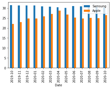
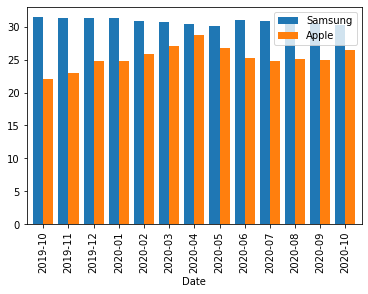
matplotlib: 2개의 y를 겹쳐그리기
- 예시1
- 예시2: width 옵션으로 폭조정
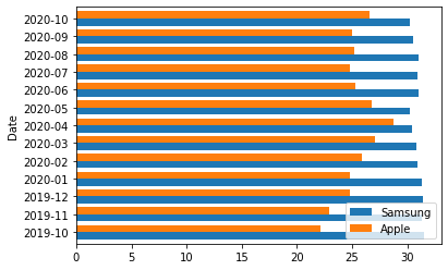
matplotlib: 2개의 y를 겹쳐그리기 + x,y 플립
- 예시1: barh를 이용하여 플립
plotly: 모든y를 stacked bar로 나타내기
- 예시1
plotly: 3개의 y를 겹쳐그리기
- 예시1
| Date | variable | value | |
|---|---|---|---|
| 0 | 2019-10 | Samsung | 31.49 |
| 1 | 2019-11 | Samsung | 31.36 |
| 2 | 2019-12 | Samsung | 31.37 |
| 3 | 2020-01 | Samsung | 31.29 |
| 4 | 2020-02 | Samsung | 30.91 |
| 5 | 2020-03 | Samsung | 30.80 |
| 6 | 2020-04 | Samsung | 30.41 |
| 7 | 2020-05 | Samsung | 30.18 |
| 8 | 2020-06 | Samsung | 31.06 |
| 9 | 2020-07 | Samsung | 30.95 |
| 10 | 2020-08 | Samsung | 31.04 |
| 11 | 2020-09 | Samsung | 30.57 |
| 12 | 2020-10 | Samsung | 30.25 |
| 13 | 2019-10 | Apple | 22.09 |
| 14 | 2019-11 | Apple | 22.90 |
| 15 | 2019-12 | Apple | 24.79 |
| 16 | 2020-01 | Apple | 24.76 |
| 17 | 2020-02 | Apple | 25.89 |
| 18 | 2020-03 | Apple | 27.03 |
| 19 | 2020-04 | Apple | 28.79 |
| 20 | 2020-05 | Apple | 26.72 |
| 21 | 2020-06 | Apple | 25.26 |
| 22 | 2020-07 | Apple | 24.82 |
| 23 | 2020-08 | Apple | 25.15 |
| 24 | 2020-09 | Apple | 24.98 |
| 25 | 2020-10 | Apple | 26.53 |
| 26 | 2019-10 | Huawei | 10.02 |
| 27 | 2019-11 | Huawei | 10.18 |
| 28 | 2019-12 | Huawei | 9.95 |
| 29 | 2020-01 | Huawei | 10.61 |
| 30 | 2020-02 | Huawei | 10.98 |
| 31 | 2020-03 | Huawei | 10.70 |
| 32 | 2020-04 | Huawei | 10.28 |
| 33 | 2020-05 | Huawei | 10.39 |
| 34 | 2020-06 | Huawei | 10.69 |
| 35 | 2020-07 | Huawei | 10.75 |
| 36 | 2020-08 | Huawei | 10.73 |
| 37 | 2020-09 | Huawei | 10.58 |
| 38 | 2020-10 | Huawei | 10.44 |
plotly: 3개의 y를 겹쳐그리기 + text
- 예시1
plotly: 면분할로 subplot그리기 (facet_col)
plotly: 면분할로 subplot그리기 (facet_row)
boxplot
data: 팁
| total_bill | tip | sex | smoker | day | time | size | |
|---|---|---|---|---|---|---|---|
| 0 | 16.99 | 1.01 | Female | No | Sun | Dinner | 2 |
| 1 | 10.34 | 1.66 | Male | No | Sun | Dinner | 3 |
| 2 | 21.01 | 3.50 | Male | No | Sun | Dinner | 3 |
| 3 | 23.68 | 3.31 | Male | No | Sun | Dinner | 2 |
| 4 | 24.59 | 3.61 | Female | No | Sun | Dinner | 4 |
| ... | ... | ... | ... | ... | ... | ... | ... |
| 239 | 29.03 | 5.92 | Male | No | Sat | Dinner | 3 |
| 240 | 27.18 | 2.00 | Female | Yes | Sat | Dinner | 2 |
| 241 | 22.67 | 2.00 | Male | Yes | Sat | Dinner | 2 |
| 242 | 17.82 | 1.75 | Male | No | Sat | Dinner | 2 |
| 243 | 18.78 | 3.00 | Female | No | Thur | Dinner | 2 |
244 rows × 7 columns
plotly: 팁의 박스플랏
- y=‘tip’
plotly: 시간에 따른 팁의 박스플랏
- y='tip', x='time'
- 저녁에 좀 더 잘주는것 같음
plotly: 시간과 성별에 따른 팁의 박스플랏
- 예시1: y='tip', x='time', color='sex'
- 예시2: y='tip', x='time', color='sex', points='all'
plotly: 시간,성별,요일에 따른 팁의 박스플랏
- 예시1: y='tip', x='time', color='sex', facet_col='day'
df.plot.box(backend='plotly', facet_row='day',x='time',y='tip',color='sex',points='all',height=1000)- 예시2: y='tip', color='sex', facet_col='time', facet_row='day'
plotly: 시간,성별,요일,흡연에 따른 팁의 박스플랏
histogram
data: 인사자료
df = pd.read_csv('https://raw.githubusercontent.com/guebin/DV2022/master/posts/HRDataset_v14.csv')
df| Employee_Name | EmpID | MarriedID | MaritalStatusID | GenderID | EmpStatusID | DeptID | PerfScoreID | FromDiversityJobFairID | Salary | ... | ManagerName | ManagerID | RecruitmentSource | PerformanceScore | EngagementSurvey | EmpSatisfaction | SpecialProjectsCount | LastPerformanceReview_Date | DaysLateLast30 | Absences | |
|---|---|---|---|---|---|---|---|---|---|---|---|---|---|---|---|---|---|---|---|---|---|
| 0 | Adinolfi, Wilson K | 10026 | 0 | 0 | 1 | 1 | 5 | 4 | 0 | 62506 | ... | Michael Albert | 22.0 | Exceeds | 4.60 | 5 | 0 | 1/17/2019 | 0 | 1 | |
| 1 | Ait Sidi, Karthikeyan | 10084 | 1 | 1 | 1 | 5 | 3 | 3 | 0 | 104437 | ... | Simon Roup | 4.0 | Indeed | Fully Meets | 4.96 | 3 | 6 | 2/24/2016 | 0 | 17 |
| 2 | Akinkuolie, Sarah | 10196 | 1 | 1 | 0 | 5 | 5 | 3 | 0 | 64955 | ... | Kissy Sullivan | 20.0 | Fully Meets | 3.02 | 3 | 0 | 5/15/2012 | 0 | 3 | |
| 3 | Alagbe,Trina | 10088 | 1 | 1 | 0 | 1 | 5 | 3 | 0 | 64991 | ... | Elijiah Gray | 16.0 | Indeed | Fully Meets | 4.84 | 5 | 0 | 1/3/2019 | 0 | 15 |
| 4 | Anderson, Carol | 10069 | 0 | 2 | 0 | 5 | 5 | 3 | 0 | 50825 | ... | Webster Butler | 39.0 | Google Search | Fully Meets | 5.00 | 4 | 0 | 2/1/2016 | 0 | 2 |
| ... | ... | ... | ... | ... | ... | ... | ... | ... | ... | ... | ... | ... | ... | ... | ... | ... | ... | ... | ... | ... | ... |
| 306 | Woodson, Jason | 10135 | 0 | 0 | 1 | 1 | 5 | 3 | 0 | 65893 | ... | Kissy Sullivan | 20.0 | Fully Meets | 4.07 | 4 | 0 | 2/28/2019 | 0 | 13 | |
| 307 | Ybarra, Catherine | 10301 | 0 | 0 | 0 | 5 | 5 | 1 | 0 | 48513 | ... | Brannon Miller | 12.0 | Google Search | PIP | 3.20 | 2 | 0 | 9/2/2015 | 5 | 4 |
| 308 | Zamora, Jennifer | 10010 | 0 | 0 | 0 | 1 | 3 | 4 | 0 | 220450 | ... | Janet King | 2.0 | Employee Referral | Exceeds | 4.60 | 5 | 6 | 2/21/2019 | 0 | 16 |
| 309 | Zhou, Julia | 10043 | 0 | 0 | 0 | 1 | 3 | 3 | 0 | 89292 | ... | Simon Roup | 4.0 | Employee Referral | Fully Meets | 5.00 | 3 | 5 | 2/1/2019 | 0 | 11 |
| 310 | Zima, Colleen | 10271 | 0 | 4 | 0 | 1 | 5 | 3 | 0 | 45046 | ... | David Stanley | 14.0 | Fully Meets | 4.50 | 5 | 0 | 1/30/2019 | 0 | 2 |
311 rows × 36 columns
인종별 급여비교 (단순 groupby)
급여의 시각화
- 예시1
df.query('RaceDesc == "Black or African American" or RaceDesc == "White"')\
.plot.hist(backend='plotly',x='Salary',color='RaceDesc',facet_col='RaceDesc')
- 예시2