판다스백엔드– 야후 파이낸스, 핸드폰점유율, 팁, 인사자료 분석
강의영상
https://youtube.com/playlist?list=PLQqh36zP38-zHuwhUiXQm0kfTDfjtRoHT
import
line
data1: 야후 파이낸스
- yahoo finance: https://finance.yahoo.com/
| Symbols | AMZN | AAPL | GOOG | MSFT | NFLX | NVDA | TSLA |
|---|---|---|---|---|---|---|---|
| Date | |||||||
| 2019-12-31 | 92.391998 | 71.920570 | 66.850998 | 153.313202 | 323.570007 | 58.637028 | 27.888666 |
| 2020-01-02 | 94.900497 | 73.561531 | 68.368500 | 156.151947 | 329.809998 | 59.785847 | 28.684000 |
| 2020-01-03 | 93.748497 | 72.846367 | 68.032997 | 154.207596 | 325.899994 | 58.828911 | 29.534000 |
| 2020-01-06 | 95.143997 | 73.426834 | 69.710503 | 154.606186 | 335.829987 | 59.075623 | 30.102667 |
| 2020-01-07 | 95.343002 | 73.081490 | 69.667000 | 153.196518 | 330.750000 | 59.790825 | 31.270666 |
| ... | ... | ... | ... | ... | ... | ... | ... |
| 2022-10-24 | 119.820000 | 149.202484 | 102.970001 | 246.555176 | 282.450012 | 125.989998 | 211.250000 |
| 2022-10-25 | 120.599998 | 152.087708 | 104.930000 | 249.955582 | 291.019989 | 132.610001 | 222.419998 |
| 2022-10-26 | 115.660004 | 149.102661 | 94.820000 | 230.669937 | 298.619995 | 128.960007 | 224.639999 |
| 2022-10-27 | 110.959999 | 144.560196 | 92.599998 | 226.112778 | 296.940002 | 131.759995 | 225.089996 |
| 2022-10-28 | 103.410004 | 155.482086 | 96.580002 | 235.207138 | 295.720001 | 138.339996 | 228.520004 |
714 rows × 7 columns
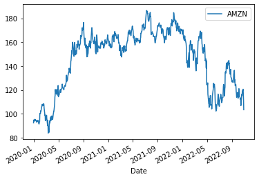
matplotlib: 1개의 y를 그리기
- 예시1: 1개의 y를 그리기


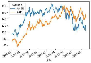
matplotlib: 2개의 y를 겹쳐서 그리기
- 2개의 y를 겹쳐그리기
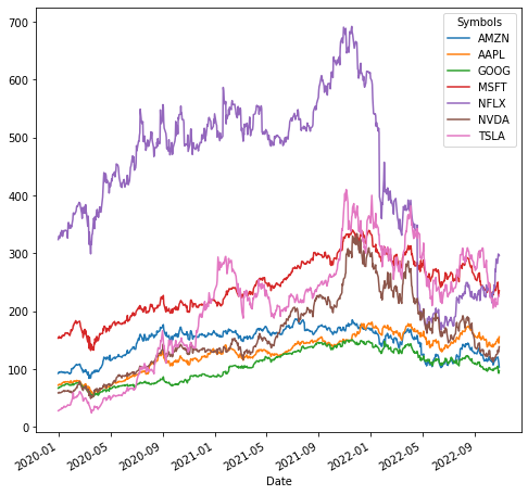
matplotlib: 모든 y를 겹쳐서 그리기
- 모든 y를 겹쳐서 그리기

matplotlib: 그림크기조정
- 모든 y를 겹쳐서 그리기 + 그림크기조정
matplotlib: 서브플랏
- 예시1: 기본 서브플랏
array([<AxesSubplot:xlabel='Date'>, <AxesSubplot:xlabel='Date'>,
       <AxesSubplot:xlabel='Date'>, <AxesSubplot:xlabel='Date'>,
       <AxesSubplot:xlabel='Date'>, <AxesSubplot:xlabel='Date'>,
       <AxesSubplot:xlabel='Date'>], dtype=object)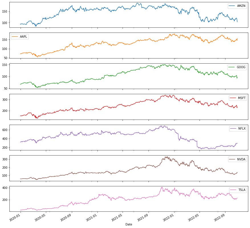
- 예시2: 레이아웃 조정
array([[<AxesSubplot:xlabel='Date'>, <AxesSubplot:xlabel='Date'>],
       [<AxesSubplot:xlabel='Date'>, <AxesSubplot:xlabel='Date'>],
       [<AxesSubplot:xlabel='Date'>, <AxesSubplot:xlabel='Date'>],
       [<AxesSubplot:xlabel='Date'>, <AxesSubplot:xlabel='Date'>]],
      dtype=object)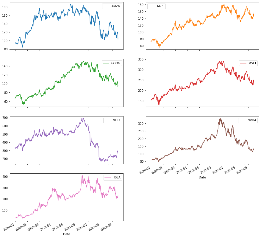
matplotlib: 폰트조정
- 예시1
array([[<AxesSubplot:xlabel='Date'>, <AxesSubplot:xlabel='Date'>],
       [<AxesSubplot:xlabel='Date'>, <AxesSubplot:xlabel='Date'>],
       [<AxesSubplot:xlabel='Date'>, <AxesSubplot:xlabel='Date'>],
       [<AxesSubplot:xlabel='Date'>, <AxesSubplot:xlabel='Date'>]],
      dtype=object)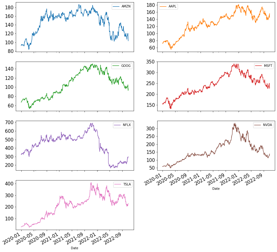
matplotlib: 레전드삭제
- 레전드삭제
array([[<AxesSubplot:xlabel='Date'>, <AxesSubplot:xlabel='Date'>],
       [<AxesSubplot:xlabel='Date'>, <AxesSubplot:xlabel='Date'>],
       [<AxesSubplot:xlabel='Date'>, <AxesSubplot:xlabel='Date'>],
       [<AxesSubplot:xlabel='Date'>, <AxesSubplot:xlabel='Date'>]],
      dtype=object)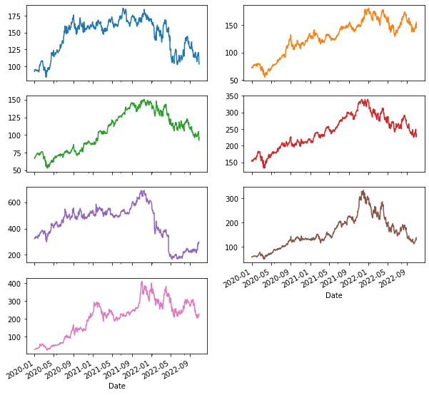
plotly 모든y를 겹쳐서 그리기
bar
data2: 핸드폰점유율
df = pd.read_csv('https://raw.githubusercontent.com/kalilurrahman/datasets/main/mobilephonemktshare2020.csv')
df| Date | Samsung | Apple | Huawei | Xiaomi | Oppo | Mobicel | Motorola | LG | Others | Realme | Nokia | Lenovo | OnePlus | Sony | Asus | ||
|---|---|---|---|---|---|---|---|---|---|---|---|---|---|---|---|---|---|
| 0 | 2019-10 | 31.49 | 22.09 | 10.02 | 7.79 | 4.10 | 3.15 | 2.41 | 2.40 | 9.51 | 0.54 | 2.35 | 0.95 | 0.96 | 0.70 | 0.84 | 0.74 |
| 1 | 2019-11 | 31.36 | 22.90 | 10.18 | 8.16 | 4.42 | 3.41 | 2.40 | 2.40 | 9.10 | 0.78 | 0.66 | 0.97 | 0.97 | 0.73 | 0.83 | 0.75 |
| 2 | 2019-12 | 31.37 | 24.79 | 9.95 | 7.73 | 4.23 | 3.19 | 2.50 | 2.54 | 8.13 | 0.84 | 0.75 | 0.90 | 0.87 | 0.74 | 0.77 | 0.70 |
| 3 | 2020-01 | 31.29 | 24.76 | 10.61 | 8.10 | 4.25 | 3.02 | 2.42 | 2.40 | 7.55 | 0.88 | 0.69 | 0.88 | 0.86 | 0.79 | 0.80 | 0.69 |
| 4 | 2020-02 | 30.91 | 25.89 | 10.98 | 7.80 | 4.31 | 2.89 | 2.36 | 2.34 | 7.06 | 0.89 | 0.70 | 0.81 | 0.77 | 0.78 | 0.80 | 0.69 |
| 5 | 2020-03 | 30.80 | 27.03 | 10.70 | 7.70 | 4.30 | 2.87 | 2.35 | 2.28 | 6.63 | 0.93 | 0.73 | 0.72 | 0.74 | 0.78 | 0.76 | 0.66 |
| 6 | 2020-04 | 30.41 | 28.79 | 10.28 | 7.60 | 4.20 | 2.75 | 2.51 | 2.28 | 5.84 | 0.90 | 0.75 | 0.69 | 0.71 | 0.80 | 0.76 | 0.70 |
| 7 | 2020-05 | 30.18 | 26.72 | 10.39 | 8.36 | 4.70 | 3.12 | 2.46 | 2.19 | 6.31 | 1.04 | 0.70 | 0.73 | 0.77 | 0.81 | 0.78 | 0.76 |
| 8 | 2020-06 | 31.06 | 25.26 | 10.69 | 8.55 | 4.65 | 3.18 | 2.57 | 2.11 | 6.39 | 1.04 | 0.68 | 0.74 | 0.75 | 0.77 | 0.78 | 0.75 |
| 9 | 2020-07 | 30.95 | 24.82 | 10.75 | 8.94 | 4.69 | 3.46 | 2.45 | 2.03 | 6.41 | 1.13 | 0.65 | 0.76 | 0.74 | 0.76 | 0.75 | 0.72 |
| 10 | 2020-08 | 31.04 | 25.15 | 10.73 | 8.90 | 4.69 | 3.38 | 2.39 | 1.96 | 6.31 | 1.18 | 0.63 | 0.74 | 0.72 | 0.75 | 0.73 | 0.70 |
| 11 | 2020-09 | 30.57 | 24.98 | 10.58 | 9.49 | 4.94 | 3.50 | 2.27 | 1.88 | 6.12 | 1.45 | 0.63 | 0.74 | 0.67 | 0.81 | 0.69 | 0.67 |
| 12 | 2020-10 | 30.25 | 26.53 | 10.44 | 9.67 | 4.83 | 2.54 | 2.21 | 1.79 | 6.04 | 1.55 | 0.63 | 0.69 | 0.65 | 0.85 | 0.67 | 0.64 |
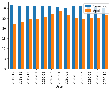
matplotlib: 2개의 y를 겹쳐그리기
- 예시1
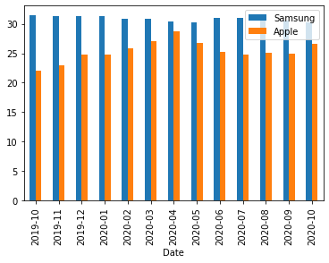
- 예시2: width 옵션으로 폭조정
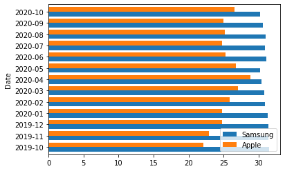
matplotlib: 2개의 y를 겹쳐그리기 + x,y 플립
- 예시1: barh를 이용하여 플립
plotly: 모든y를 stacked bar로 나타내기
- 예시1
plotly: 3개의 y를 겹쳐그리기
- 예시1
plotly: 3개의 y를 겹쳐그리기 + text
- 예시1
plotly: 면분할로 subplot그리기 (facet_col)
plotly: 면분할로 subplot그리기 (facet_row)
boxplot
data3: 팁
| total_bill | tip | sex | smoker | day | time | size | |
|---|---|---|---|---|---|---|---|
| 0 | 16.99 | 1.01 | Female | No | Sun | Dinner | 2 |
| 1 | 10.34 | 1.66 | Male | No | Sun | Dinner | 3 |
| 2 | 21.01 | 3.50 | Male | No | Sun | Dinner | 3 |
| 3 | 23.68 | 3.31 | Male | No | Sun | Dinner | 2 |
| 4 | 24.59 | 3.61 | Female | No | Sun | Dinner | 4 |
| ... | ... | ... | ... | ... | ... | ... | ... |
| 239 | 29.03 | 5.92 | Male | No | Sat | Dinner | 3 |
| 240 | 27.18 | 2.00 | Female | Yes | Sat | Dinner | 2 |
| 241 | 22.67 | 2.00 | Male | Yes | Sat | Dinner | 2 |
| 242 | 17.82 | 1.75 | Male | No | Sat | Dinner | 2 |
| 243 | 18.78 | 3.00 | Female | No | Thur | Dinner | 2 |
244 rows × 7 columns
plotly: 팁의 박스플랏
- y=‘tip’
plotly: 시간에 따른 팁의 박스플랏
- y='tip', x='time'
- 저녁에 좀 더 잘주는것 같음
plotly: 시간과 성별에 따른 팁의 박스플랏
- 예시1: y='tip', x='time', color='sex'
- 예시2: y='tip', x='time', color='sex', points='all'
plotly: 시간,성별,요일에 따른 팁의 박스플랏
- 예시1: y='tip', x='time', color='sex', facet_col='day'
df.plot.box(backend='plotly', facet_row='day',x='time',y='tip',color='sex',points='all',height=1000)- 예시2: y='tip', color='sex', facet_col='time', facet_row='day'
plotly: 시간,성별,요일,흡연에 따른 팁의 박스플랏
histogram
data4: 인사자료
df = pd.read_csv('https://raw.githubusercontent.com/guebin/DV2022/master/posts/HRDataset_v14.csv')
df| Employee_Name | EmpID | MarriedID | MaritalStatusID | GenderID | EmpStatusID | DeptID | PerfScoreID | FromDiversityJobFairID | Salary | ... | ManagerName | ManagerID | RecruitmentSource | PerformanceScore | EngagementSurvey | EmpSatisfaction | SpecialProjectsCount | LastPerformanceReview_Date | DaysLateLast30 | Absences | |
|---|---|---|---|---|---|---|---|---|---|---|---|---|---|---|---|---|---|---|---|---|---|
| 0 | Adinolfi, Wilson K | 10026 | 0 | 0 | 1 | 1 | 5 | 4 | 0 | 62506 | ... | Michael Albert | 22.0 | Exceeds | 4.60 | 5 | 0 | 1/17/2019 | 0 | 1 | |
| 1 | Ait Sidi, Karthikeyan | 10084 | 1 | 1 | 1 | 5 | 3 | 3 | 0 | 104437 | ... | Simon Roup | 4.0 | Indeed | Fully Meets | 4.96 | 3 | 6 | 2/24/2016 | 0 | 17 |
| 2 | Akinkuolie, Sarah | 10196 | 1 | 1 | 0 | 5 | 5 | 3 | 0 | 64955 | ... | Kissy Sullivan | 20.0 | Fully Meets | 3.02 | 3 | 0 | 5/15/2012 | 0 | 3 | |
| 3 | Alagbe,Trina | 10088 | 1 | 1 | 0 | 1 | 5 | 3 | 0 | 64991 | ... | Elijiah Gray | 16.0 | Indeed | Fully Meets | 4.84 | 5 | 0 | 1/3/2019 | 0 | 15 |
| 4 | Anderson, Carol | 10069 | 0 | 2 | 0 | 5 | 5 | 3 | 0 | 50825 | ... | Webster Butler | 39.0 | Google Search | Fully Meets | 5.00 | 4 | 0 | 2/1/2016 | 0 | 2 |
| ... | ... | ... | ... | ... | ... | ... | ... | ... | ... | ... | ... | ... | ... | ... | ... | ... | ... | ... | ... | ... | ... |
| 306 | Woodson, Jason | 10135 | 0 | 0 | 1 | 1 | 5 | 3 | 0 | 65893 | ... | Kissy Sullivan | 20.0 | Fully Meets | 4.07 | 4 | 0 | 2/28/2019 | 0 | 13 | |
| 307 | Ybarra, Catherine | 10301 | 0 | 0 | 0 | 5 | 5 | 1 | 0 | 48513 | ... | Brannon Miller | 12.0 | Google Search | PIP | 3.20 | 2 | 0 | 9/2/2015 | 5 | 4 |
| 308 | Zamora, Jennifer | 10010 | 0 | 0 | 0 | 1 | 3 | 4 | 0 | 220450 | ... | Janet King | 2.0 | Employee Referral | Exceeds | 4.60 | 5 | 6 | 2/21/2019 | 0 | 16 |
| 309 | Zhou, Julia | 10043 | 0 | 0 | 0 | 1 | 3 | 3 | 0 | 89292 | ... | Simon Roup | 4.0 | Employee Referral | Fully Meets | 5.00 | 3 | 5 | 2/1/2019 | 0 | 11 |
| 310 | Zima, Colleen | 10271 | 0 | 4 | 0 | 1 | 5 | 3 | 0 | 45046 | ... | David Stanley | 14.0 | Fully Meets | 4.50 | 5 | 0 | 1/30/2019 | 0 | 2 |
311 rows × 36 columns
인종별 급여비교 (단순 groupby)
급여의 시각화
- 예시1
df.query('RaceDesc == "Black or African American" or RaceDesc == "White"')\
.plot.hist(backend='plotly',x='Salary',color='RaceDesc',facet_col='RaceDesc')
- 예시2
df.query('RaceDesc == "Black or African American" or RaceDesc == "White"')\
.plot.hist(backend='plotly',x='Salary',color='RaceDesc',facet_col='RaceDesc',histnorm='probability')- 현장강의에서 histnorm=’probability density’에서 histnorm=’probability’로 수정