import numpy as np
import pandas as pd
import plotly.express as px
import plotly.io as pio12wk-2: NYCTaxi 자료 분석 (2)
plotly
![]()
1. 강의영상
2. Imports
pd.options.plotting.backend = "plotly"
pio.templates.default = "plotly_white"
3. 데이터준비
df = pd.read_csv("https://raw.githubusercontent.com/guebin/DV2023/main/posts/NYCTaxi.csv")
df_feature = df.assign(
    log_trip_duration = np.log(df.trip_duration),
    pickup_datetime = df.pickup_datetime.apply(pd.to_datetime),
    dropoff_datetime = df.dropoff_datetime.apply(pd.to_datetime),
    dist = np.sqrt((df.pickup_latitude-df.dropoff_latitude)**2 + (df.pickup_longitude-df.dropoff_longitude)**2),
    #---#
    vendor_id = df.vendor_id.map({1:'A',2:'B'})
).assign(
    speed = lambda df: df.dist / df.trip_duration,
    pickup_hour = lambda df: df.pickup_datetime.dt.hour,
    dropoff_hour = lambda df: df.dropoff_datetime.dt.hour,
    dayofweek = lambda df: df.pickup_datetime.dt.dayofweek
)df_feature.head()| id | vendor_id | pickup_datetime | dropoff_datetime | passenger_count | pickup_longitude | pickup_latitude | dropoff_longitude | dropoff_latitude | store_and_fwd_flag | trip_duration | log_trip_duration | dist | speed | pickup_hour | dropoff_hour | dayofweek | |
|---|---|---|---|---|---|---|---|---|---|---|---|---|---|---|---|---|---|
| 0 | id2875421 | B | 2016-03-14 17:24:55 | 2016-03-14 17:32:30 | 1 | -73.982155 | 40.767937 | -73.964630 | 40.765602 | N | 455 | 6.120297 | 0.017680 | 0.000039 | 17 | 17 | 0 |
| 1 | id3194108 | A | 2016-06-01 11:48:41 | 2016-06-01 12:19:07 | 1 | -74.005028 | 40.746452 | -73.972008 | 40.745781 | N | 1826 | 7.509883 | 0.033027 | 0.000018 | 11 | 12 | 2 |
| 2 | id3564028 | A | 2016-01-02 01:16:42 | 2016-01-02 01:19:56 | 1 | -73.954132 | 40.774784 | -73.947418 | 40.779633 | N | 194 | 5.267858 | 0.008282 | 0.000043 | 1 | 1 | 5 |
| 3 | id1660823 | B | 2016-03-01 06:40:18 | 2016-03-01 07:01:37 | 5 | -73.982140 | 40.775326 | -74.009850 | 40.721699 | N | 1279 | 7.153834 | 0.060363 | 0.000047 | 6 | 7 | 1 |
| 4 | id1575277 | B | 2016-06-11 16:59:15 | 2016-06-11 17:33:27 | 1 | -73.999229 | 40.722881 | -73.982880 | 40.778297 | N | 2052 | 7.626570 | 0.057778 | 0.000028 | 16 | 17 | 5 |
4. 시각화3 – 애니메이션
A. scatter / (vendor_id,passenger_count,hour)
- 시각화
df_feature.columnsIndex(['id', 'vendor_id', 'pickup_datetime', 'dropoff_datetime',
'passenger_count', 'pickup_longitude', 'pickup_latitude',
'dropoff_longitude', 'dropoff_latitude', 'store_and_fwd_flag',
'trip_duration', 'log_trip_duration', 'dist', 'speed', 'pickup_hour',
'dropoff_hour', 'dayofweek'],
dtype='object')fig = px.scatter_mapbox(
data_frame=df_feature.sort_values('pickup_hour'),
lat = 'pickup_latitude',
lon = 'pickup_longitude',
color = 'vendor_id',
size = 'passenger_count', size_max = 5,
animation_frame = 'pickup_hour',
center = {'lat':40.7322, 'lon':-73.9052},
#---#
mapbox_style = 'carto-positron',
zoom=10,
width = 750,
height = 600
)
fig.show(config={'scrollZoom':False})- B가 전체적으로 동그라미가 크다. (한 택시에 탑승하는 승객수는 B업체가 더 많은듯)
- 시간대별로 확실히 빈도수가 다르다.
- 추가시각화1 – vendor_id별 passenger_count를 barplot으로 시각화
df_feature.groupby('vendor_id').agg({'passenger_count':'mean'})\
.reset_index()\
.plot.bar(y='vendor_id',x='passenger_count',color='vendor_id')- B가 한 택시당 평균승객이 많다. (B는 대형차량위주로 운행하는 회사이지 않을까?)
- 추가시각화2 – vendor_id별 passenger_count를 boxplot으로 시각화
df_feature.plot.box(x='vendor_id',y='passenger_count',color='vendor_id')- 추가시각화3 – vendor_id별 passenger_count를 histogram으로 시각화
df_feature.plot.hist(x='passenger_count',color='vendor_id', facet_col='vendor_id')- 추가시각화4 – pickup_hour별 count를 barplot으로 시각화
df_feature.pickup_hour.value_counts().sort_index().plot.bar()- 추가시각화5 – (pickup_hour,vendor_id)별 count를 barplot으로 시각화
df_feature.groupby(['pickup_hour','vendor_id'])\
.agg('size').reset_index().rename({0:'count'},axis=1)\
.plot.bar(x='pickup_hour',y='count',color='vendor_id',facet_col='vendor_id')
- 추가시각화6 – (pickup_hour,vendor_id)별 count를 areaplot으로 시각화
df_feature.groupby(['pickup_hour','vendor_id'])\
.agg('size').reset_index().rename({0:'count'},axis=1)\
.plot.area(x='pickup_hour',y='count',color='vendor_id')
- 추가시각화7 – (pickup_hour,vendor_id)별 count를 lineplot으로 시각화
df_feature.groupby(['pickup_hour','vendor_id'])\
.agg('size').reset_index().rename({0:'count'},axis=1)\
.plot.line(x='pickup_hour',y='count',color='vendor_id')
B. scatter / (vendor_id,day_of_week)
fig = px.scatter_mapbox(
    data_frame=df_feature.sort_values('dayofweek'),
    lat = 'pickup_latitude',
    lon = 'pickup_longitude',
    color = 'vendor_id',
    size = 'passenger_count', size_max = 5,
    animation_frame = 'dayofweek',
    center = {'lat':40.7322, 'lon':-73.9052},
    #---#
    mapbox_style = 'carto-positron',
    zoom=10,
    width = 750,
    height = 600
)
fig.show(config={'scrollZoom':False})- 생각보다 요일별 특징은 그다지 뚜렷하지 않음.
5. 시각화4 – heatmap
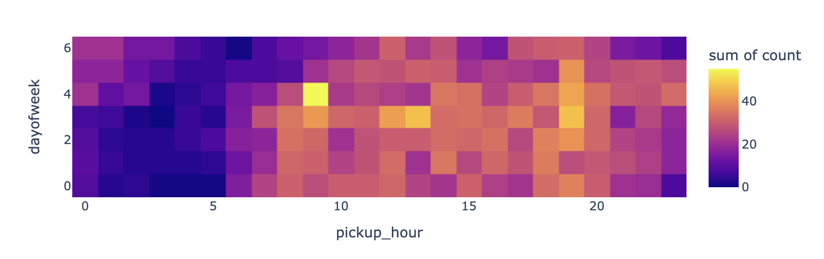
A. (요일,시간)에 따른 count 시각화
tidydata = df_feature.pivot_table(
    index = 'pickup_hour',
    columns = 'dayofweek',
    aggfunc = 'size'
).stack().reset_index().rename({0:'count'},axis=1)
px.density_heatmap(
    data_frame=tidydata,
    x='pickup_hour',
    y='dayofweek',
    z='count',
    nbinsx=24,
    nbinsy=7,
    height=300
)- 노란색: 불금? 피크타임?
B. (요일,시간)에 따른 dist 시각화
tidydata = df_feature.pivot_table(
    index = 'pickup_hour',
    columns = 'dayofweek',
    values = 'dist',
    aggfunc = 'mean'
).stack().reset_index().rename({0:'dist_mean'},axis=1)
px.density_heatmap(
    data_frame=tidydata,
    x='pickup_hour',
    y='dayofweek',
    z='dist_mean',
    nbinsx=24,
    nbinsy=7,
    height=300
)- 노란색: 일요일 아침부터 장거리.. (여행을 끝나고 복귀하는 사람들이지 않을까?)
C. (요일,시간)에 따른 speed 시각화
tidydata = df_feature.pivot_table(
    index = 'pickup_hour',
    columns = 'dayofweek',
    values = 'speed',
    aggfunc = 'mean'
).stack().reset_index().rename({0:'speed_mean'},axis=1)
px.density_heatmap(
    data_frame=tidydata,
    x='pickup_hour',
    y='dayofweek',
    z='speed_mean',
    nbinsx=24,
    nbinsy=7,
    height=300
)- 남색: 교통체증이 심한 곳 / 노란색: 교통체증이 덜한 곳
6. 시각화5 – 경로시각화
- 이거는 너무 무거워서 좀 작은 데이터로 실습합니다.
df_feature_small = df_feature[::100].reset_index(drop=True)
df_feature_small| id | vendor_id | pickup_datetime | dropoff_datetime | passenger_count | pickup_longitude | pickup_latitude | dropoff_longitude | dropoff_latitude | store_and_fwd_flag | trip_duration | log_trip_duration | dist | speed | pickup_hour | dropoff_hour | dayofweek | |
|---|---|---|---|---|---|---|---|---|---|---|---|---|---|---|---|---|---|
| 0 | id2875421 | B | 2016-03-14 17:24:55 | 2016-03-14 17:32:30 | 1 | -73.982155 | 40.767937 | -73.964630 | 40.765602 | N | 455 | 6.120297 | 0.017680 | 0.000039 | 17 | 17 | 0 |
| 1 | id3667993 | B | 2016-01-03 04:18:57 | 2016-01-03 04:27:03 | 1 | -73.980522 | 40.730530 | -73.997993 | 40.746220 | N | 486 | 6.186209 | 0.023482 | 0.000048 | 4 | 4 | 6 |
| 2 | id2002463 | B | 2016-01-14 12:28:56 | 2016-01-14 12:37:17 | 1 | -73.965652 | 40.768398 | -73.960068 | 40.779308 | N | 501 | 6.216606 | 0.012256 | 0.000024 | 12 | 12 | 3 |
| 3 | id1635353 | B | 2016-03-04 23:20:58 | 2016-03-04 23:49:29 | 5 | -73.985092 | 40.759190 | -73.962151 | 40.709850 | N | 1711 | 7.444833 | 0.054412 | 0.000032 | 23 | 23 | 4 |
| 4 | id1850636 | A | 2016-02-05 00:21:28 | 2016-02-05 00:52:24 | 1 | -73.994537 | 40.750439 | -74.025719 | 40.631100 | N | 1856 | 7.526179 | 0.123345 | 0.000066 | 0 | 0 | 4 |
| ... | ... | ... | ... | ... | ... | ... | ... | ... | ... | ... | ... | ... | ... | ... | ... | ... | ... |
| 141 | id0621879 | A | 2016-04-23 09:31:33 | 2016-04-23 09:51:33 | 1 | -73.950783 | 40.743614 | -74.006218 | 40.722729 | N | 1200 | 7.090077 | 0.059239 | 0.000049 | 9 | 9 | 5 |
| 142 | id2587483 | B | 2016-03-28 12:59:58 | 2016-03-28 13:08:11 | 2 | -73.953903 | 40.787079 | -73.940842 | 40.792461 | N | 493 | 6.200509 | 0.014127 | 0.000029 | 12 | 13 | 0 |
| 143 | id1030598 | B | 2016-03-03 11:44:24 | 2016-03-03 11:49:59 | 1 | -74.005066 | 40.719143 | -74.006065 | 40.735134 | N | 335 | 5.814131 | 0.016022 | 0.000048 | 11 | 11 | 3 |
| 144 | id3094934 | A | 2016-03-21 09:53:40 | 2016-03-21 10:22:20 | 1 | -73.986153 | 40.722431 | -73.985977 | 40.762669 | N | 1720 | 7.450080 | 0.040238 | 0.000023 | 9 | 10 | 0 |
| 145 | id0503659 | B | 2016-04-19 18:06:09 | 2016-04-19 18:23:09 | 2 | -73.952209 | 40.784500 | -73.966103 | 40.804832 | N | 1020 | 6.927558 | 0.024626 | 0.000024 | 18 | 18 | 1 |
146 rows × 17 columns
A. 예비학습
- 경로그리기
df_sample = pd.DataFrame(
    {'path':['A','A','B','B','B'],
     'lon':[-73.986420,-73.995300,-73.975922,-73.988922,-73.962654],
     'lat':[40.756569,40.740059,40.754192,40.762859,40.772449]}
)df_sample| path | lon | lat | |
|---|---|---|---|
| 0 | A | -73.986420 | 40.756569 |
| 1 | A | -73.995300 | 40.740059 |
| 2 | B | -73.975922 | 40.754192 |
| 3 | B | -73.988922 | 40.762859 |
| 4 | B | -73.962654 | 40.772449 |
fig = px.line_mapbox(
    data_frame=df_sample,
    lat = 'lat',
    lon = 'lon',
    color = 'path',
    line_group = 'path',
    #---#
    mapbox_style = 'carto-positron',
    zoom=12,
    width = 750,
    height = 600
)
fig.show(config={'scrollZoom':False})
- 산점도로 그리기
_fig = px.scatter_mapbox(
    data_frame=df_sample,
    lat = 'lat',
    lon = 'lon',
    color = 'path',
    #---#
    mapbox_style = 'carto-positron',
    zoom=12,
    width = 750,
    height = 600
)
_fig.show(config={'scrollZoom':False})
- 합치기
fig = px.line_mapbox(
    data_frame=df_sample,
    lat = 'lat',
    lon = 'lon',
    color = 'path',
    line_group = 'path',
    #---#
    mapbox_style = 'carto-positron',
    zoom=12,
    width = 750,
    height = 600
)
scatter_data = px.scatter_mapbox(
    data_frame=df_sample,
    lat = 'lat',
    lon = 'lon',
    color = 'path',
    #---#
    mapbox_style = 'carto-positron',
    zoom=12,
    width = 750,
    height = 600
).data
fig.add_trace(scatter_data[0])
fig.add_trace(scatter_data[1])
fig.show(config={'scrollZoom':False})
B. 전처리
pcol = ['pickup_datetime', 'pickup_longitude', 'pickup_latitude', 'pickup_hour']
dcol = ['dropoff_datetime', 'dropoff_longitude', 'dropoff_latitude', 'dropoff_hour']
def transform(df):
    pickup = df.loc[:,['id']+pcol].set_axis(['id', 'datetime', 'longitude', 'latitude', 'hour'],axis=1).assign(type = 'pickup')
    dropoff = df.loc[:,['id']+dcol].set_axis(['id', 'datetime', 'longitude', 'latitude', 'hour'],axis=1).assign(type = 'dropoff')
    return pd.concat([pickup,dropoff],axis=0)
df_left = df_feature_small.drop(pcol+dcol,axis=1)
df_right = pd.concat([transform(df) for i, df in df_feature_small.groupby('id')]).reset_index(drop=True)
df_feature_small2 = df_left.merge(df_right)
df_feature_small2.head()| id | vendor_id | passenger_count | store_and_fwd_flag | trip_duration | log_trip_duration | dist | speed | dayofweek | datetime | longitude | latitude | hour | type | |
|---|---|---|---|---|---|---|---|---|---|---|---|---|---|---|
| 0 | id2875421 | B | 1 | N | 455 | 6.120297 | 0.017680 | 0.000039 | 0 | 2016-03-14 17:24:55 | -73.982155 | 40.767937 | 17 | pickup |
| 1 | id2875421 | B | 1 | N | 455 | 6.120297 | 0.017680 | 0.000039 | 0 | 2016-03-14 17:32:30 | -73.964630 | 40.765602 | 17 | dropoff |
| 2 | id3667993 | B | 1 | N | 486 | 6.186209 | 0.023482 | 0.000048 | 6 | 2016-01-03 04:18:57 | -73.980522 | 40.730530 | 4 | pickup |
| 3 | id3667993 | B | 1 | N | 486 | 6.186209 | 0.023482 | 0.000048 | 6 | 2016-01-03 04:27:03 | -73.997993 | 40.746220 | 4 | dropoff |
| 4 | id2002463 | B | 1 | N | 501 | 6.216606 | 0.012256 | 0.000024 | 3 | 2016-01-14 12:28:56 | -73.965652 | 40.768398 | 12 | pickup |
C. vendor_id, passenger_count 시각화
fig = px.line_mapbox(
    data_frame=df_feature_small2,
    lat = 'latitude',
    lon = 'longitude',
    color = 'vendor_id',
    line_group = 'id',
    center = {'lat':40.7322, 'lon':-73.9052},
    #---#
    mapbox_style = 'carto-positron',
    zoom=10,
    width = 750,
    height = 600
)
scatter_data = px.scatter_mapbox(
    data_frame=df_feature_small2,
    lat = 'latitude',
    lon = 'longitude',
    size = 'passenger_count',
    size_max = 10,
    color = 'vendor_id',
    #---#
    mapbox_style = 'carto-positron',
    zoom=10,
    width = 750,
    height = 600
).data
for sd in scatter_data:
    fig.add_trace(sd)
fig.update_traces(
    line={
        'width':1
    },
    opacity=0.8
)
fig.show(config={'scrollZoom':False})
D. dayofweek별 시각화
tidydata = df_feature_small2.assign(dayofweek = lambda df: df.dayofweek.astype(str)).sort_values('dayofweek')
fig = px.line_mapbox(
    data_frame=tidydata,
    lat = 'latitude',
    lon = 'longitude',
    line_group = 'id',
    color = 'dayofweek',
    center = {'lat':40.7322, 'lon':-73.9052},
    #---#
    mapbox_style = 'carto-positron',
    zoom=10,
    width = 750,
    height = 600
)
scatter_data = px.scatter_mapbox(
    data_frame=tidydata,
    lat = 'latitude',
    lon = 'longitude',
    size = 'passenger_count',
    size_max = 10,
    color = 'dayofweek',
    #---#
    mapbox_style = 'carto-positron',
    zoom=10,
    width = 750,
    height = 600
).data
for sd in scatter_data:
    fig.add_trace(sd)
fig.update_traces(
    line={
        'width':1
    },
    opacity=0.8
)
fig.show(config={'scrollZoom':False})
E. speed별 시각화
tidydata = df_feature_small2.assign(
    speed_cut = pd.qcut(df_feature_small2.speed,4)
).sort_values('speed_cut')
fig = px.line_mapbox(
    data_frame=tidydata,
    lat = 'latitude',
    lon = 'longitude',
    line_group = 'id',
    color = 'speed_cut',
    center = {'lat':40.7322, 'lon':-73.9052},
    #---#
    mapbox_style = 'carto-positron',
    zoom=10,
    width = 750,
    height = 600
)
scatter_data = px.scatter_mapbox(
    data_frame=tidydata,
    lat = 'latitude',
    lon = 'longitude',
    size = 'passenger_count',
    size_max = 10,
    color = 'speed_cut',
    #---#
    mapbox_style = 'carto-positron',
    zoom=10,
    width = 750,
    height = 600
).data
for sd in scatter_data:
    fig.add_trace(sd)
fig.update_traces(
    line={
        'width':1
    },
    opacity=0.8
)
fig.show(config={'scrollZoom':False})
/home/cgb2/anaconda3/envs/ag/lib/python3.10/site-packages/plotly/express/_core.py:2044: FutureWarning:
The default of observed=False is deprecated and will be changed to True in a future version of pandas. Pass observed=False to retain current behavior or observed=True to adopt the future default and silence this warning.
7. HW
df_feature.dist.describe()count 14587.000000
mean 0.035191
std 0.041392
min 0.000000
25% 0.012819
50% 0.021380
75% 0.038631
max 0.386224
Name: dist, dtype: float64거리가 0.012819 보다 작은 거리를 근거리로 생각하자. 근거리 이동건수가 많은 요일,시간대를 알고싶다. 예를들어 월요일, 0시 (pickup_hour기준)의 근거리 이동건수는 아래와 같이 구할 수 있다.
len(df_feature.query('dayofweek ==0 and dist<0.012819 and pickup_hour == 0'))9모든 요일, 모든 시간의 근거리 이동건수를 density_heatmap을 이용하여 시각화하라.