import pandas as pd
import numpy as np
from plotnine import *06wk-2: 막대그래프, 심슨의 역설 (1)
plotnine
![]()
1. 강의영상
2. Imports
3. 비교를 위한 시각화
A. geom_col()
- 예시1: 기본적인 막대그래프
df = pd.DataFrame({'x':[0,1],'y':[40,60]})
df| x | y | |
|---|---|---|
| 0 | 0 | 40 |
| 1 | 1 | 60 |
fig = ggplot(df)
col = geom_col(aes(x='x',y='y'))
fig + col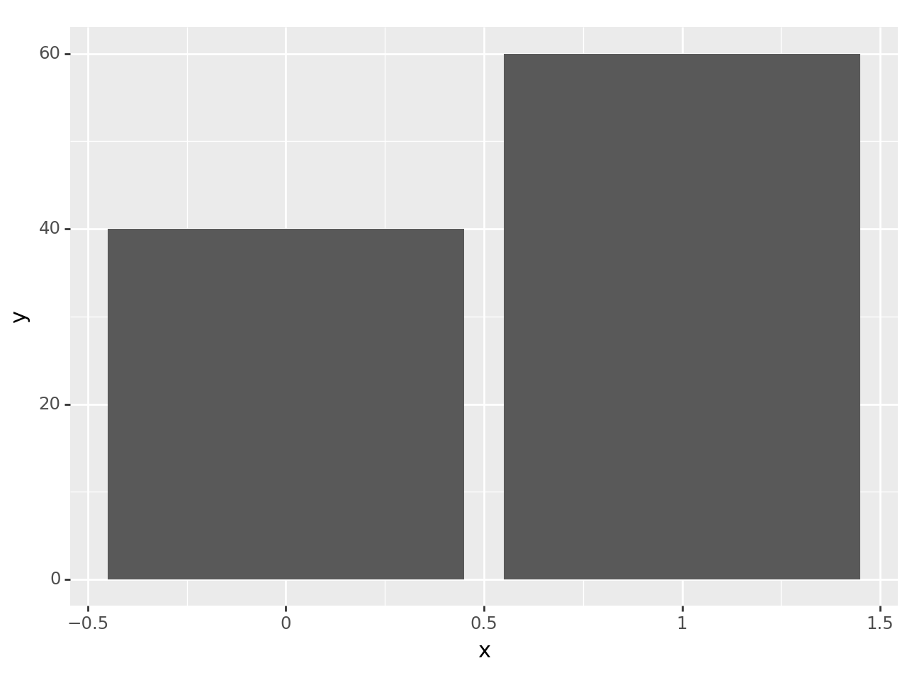
- 예시2: \(x\)축이 범주인 경우
df = pd.DataFrame({'sex':['male','female'],'score':[40,60]})
df| sex | score | |
|---|---|---|
| 0 | male | 40 |
| 1 | female | 60 |
fig = ggplot(df)
col = geom_col(aes(x='sex',y='score'))
fig + col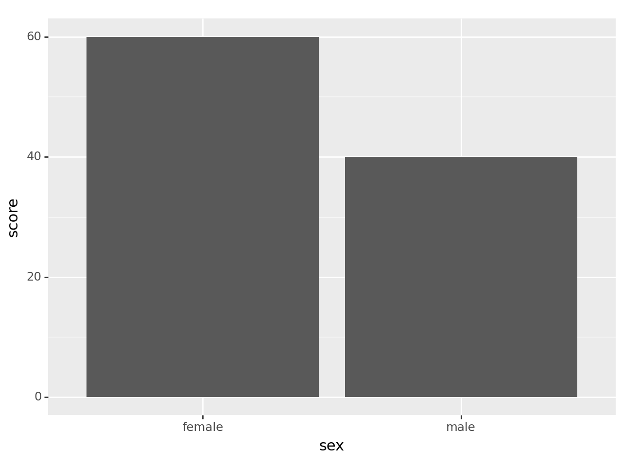
- 예시3: 예시2에서 색깔로 구분하고 싶은 경우
df = pd.DataFrame({'sex':['male','female'],'score':[40,60]})
df| sex | score | |
|---|---|---|
| 0 | male | 40 |
| 1 | female | 60 |
fig = ggplot(df)
col = geom_col(aes(x='sex',y='score',fill='sex'))
fig + col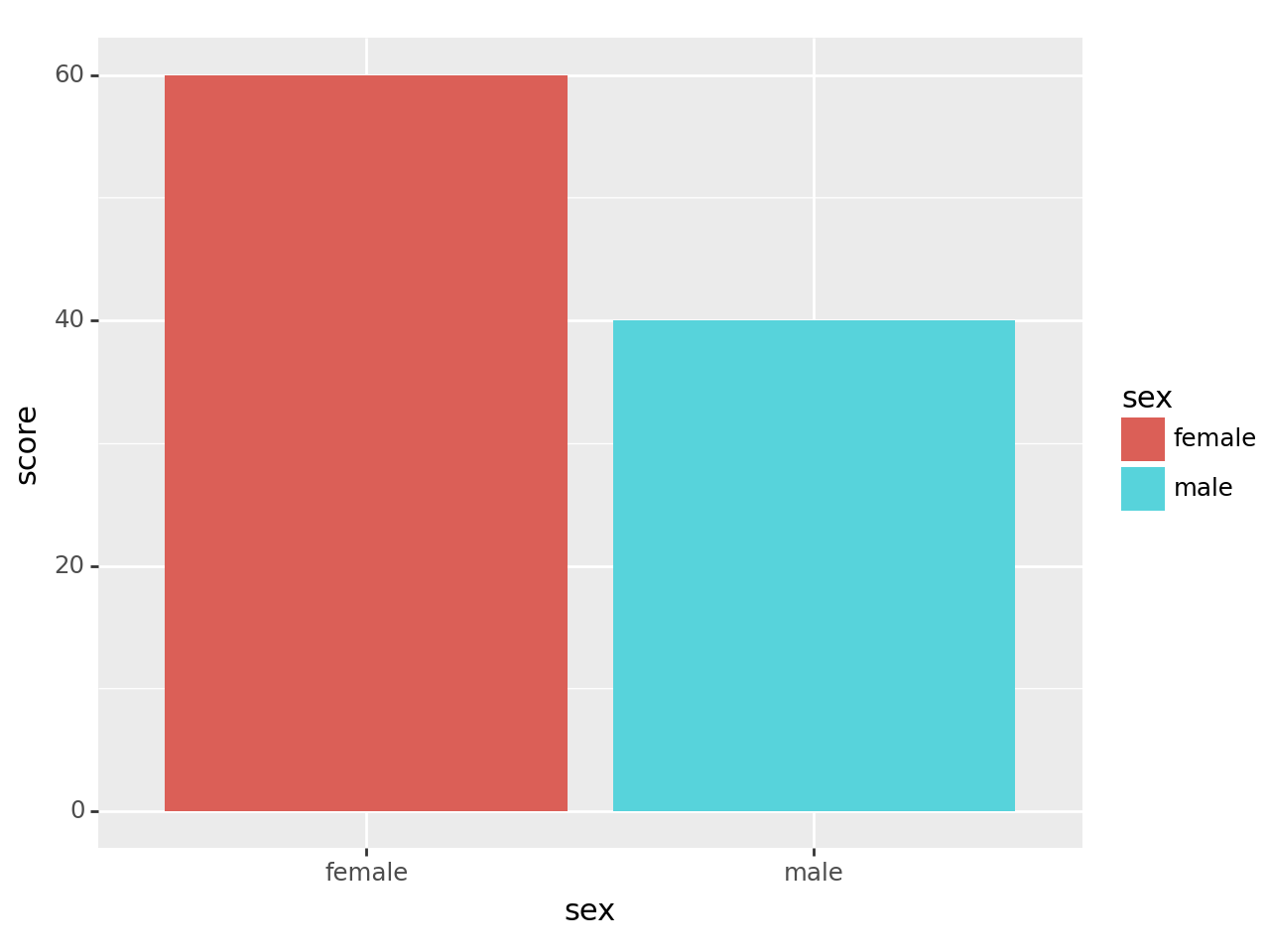
- 예시4: 예시3에서 scale_fill_manual()을 이용하여 색상변경 하기
df = pd.DataFrame({'sex':['male','female'],'score':[40,60]})
df| sex | score | |
|---|---|---|
| 0 | male | 40 |
| 1 | female | 60 |
fig = ggplot(df)
col = geom_col(aes(x='sex',y='score',fill='sex'))
fig + col + scale_fill_manual(['red','blue'])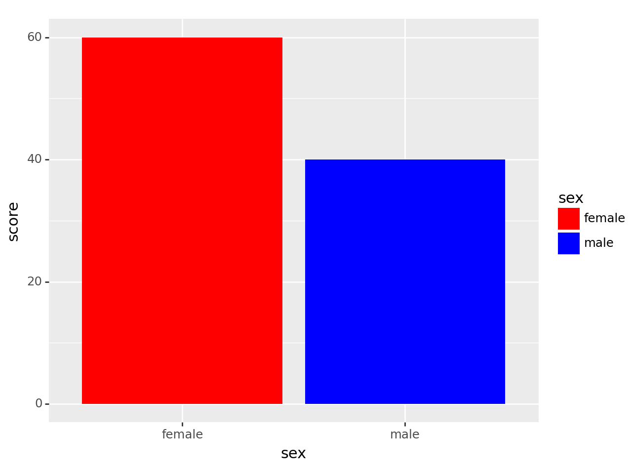
B. facet_wrap()
- 예시1: facet_wrap()을 이용한 면분할 – 반별로 면분할
df = pd.DataFrame({'sex':['male','female','male','female'],'score':[40,60,50,20],'class':['A','A','B','B']})
df| sex | score | class | |
|---|---|---|---|
| 0 | male | 40 | A |
| 1 | female | 60 | A |
| 2 | male | 50 | B |
| 3 | female | 20 | B |
fig = ggplot(df)
col = geom_col(aes(x='sex',y='score',fill='sex'))
fig + col + facet_wrap('class')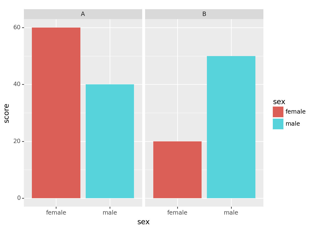
- 예시2: facet_wrap()을 이용한 면분할 – 성별로 면분할
df = pd.DataFrame({'sex':['male','female','male','female'],'score':[40,60,50,20],'class':['A','A','B','B']})
df| sex | score | class | |
|---|---|---|---|
| 0 | male | 40 | A |
| 1 | female | 60 | A |
| 2 | male | 50 | B |
| 3 | female | 20 | B |
fig = ggplot(df)
col = geom_col(aes(x='class',y='score',fill='sex'))
fig + col + facet_wrap('sex')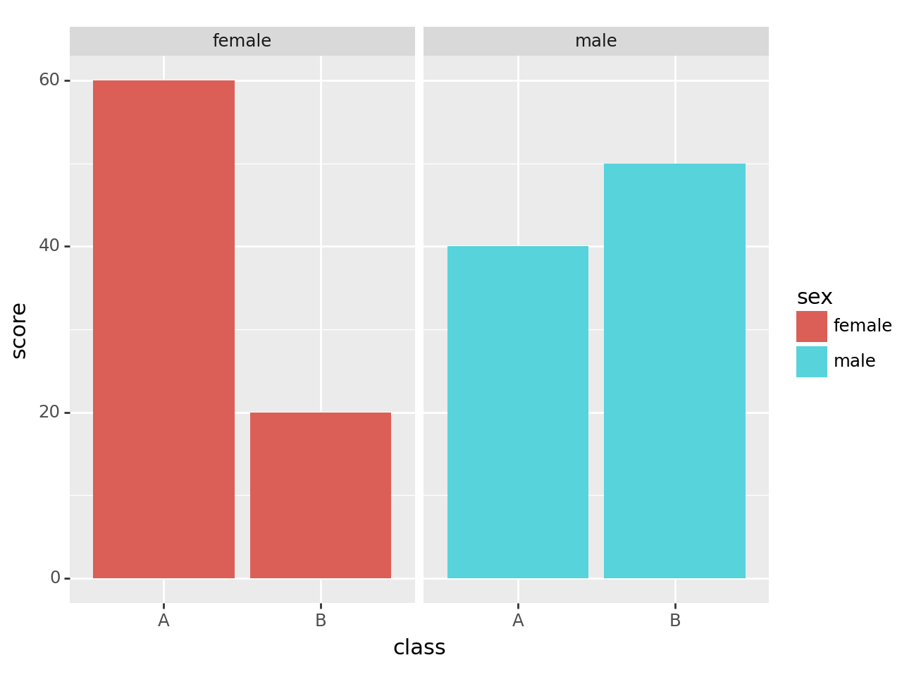
4. 심슨의 역설
- 버클리대학교의 입학데이터
- 주장: 버클리대학에 gender bias가 존재한다.
- 1973년 가을학기의 입학통계에 따르면 지원하는 남성이 여성보다 훨씬 많이 합격했고, 그 차이가 너무 커서 우연의 일치라 보기 어렵다.
df=pd.read_csv("https://raw.githubusercontent.com/guebin/DV2022/master/posts/Simpson.csv",index_col=0,header=[0,1])\
.stack().stack().reset_index()\
.rename({'level_0':'department','level_1':'result','level_2':'gender',0:'count'},axis=1)
df| department | result | gender | count | |
|---|---|---|---|---|
| 0 | A | fail | male | 314 |
| 1 | A | fail | female | 19 |
| 2 | A | pass | male | 511 |
| 3 | A | pass | female | 89 |
| 4 | B | fail | male | 208 |
| 5 | B | fail | female | 7 |
| 6 | B | pass | male | 352 |
| 7 | B | pass | female | 18 |
| 8 | C | fail | male | 204 |
| 9 | C | fail | female | 391 |
| 10 | C | pass | male | 121 |
| 11 | C | pass | female | 202 |
| 12 | D | fail | male | 279 |
| 13 | D | fail | female | 244 |
| 14 | D | pass | male | 138 |
| 15 | D | pass | female | 131 |
| 16 | E | fail | male | 137 |
| 17 | E | fail | female | 299 |
| 18 | E | pass | male | 54 |
| 19 | E | pass | female | 94 |
| 20 | F | fail | male | 149 |
| 21 | F | fail | female | 103 |
| 22 | F | pass | male | 224 |
| 23 | F | pass | female | 238 |
A. 시각화1: 전체합격률 시각화 – pandas 초보
- 여성지원자의 합격률
df.query('gender == "female" and result =="pass"')['count'].sum() / df.query('gender == "female"')['count'].sum()0.420708446866485- 남성지원자의 합격률
df.query('gender == "male" and result =="pass"')['count'].sum() / df.query('gender == "male"')['count'].sum()0.5202526941657376- 시각화
tidydata = pd.DataFrame({'male':[0.5202526941657376],'female':[0.420708446866485]})
tidydata| male | female | |
|---|---|---|
| 0 | 0.520253 | 0.420708 |
- 이렇게 데이터 프레임을 만들면 망해요
tidydata = pd.DataFrame({'sex':['male','female'],'rate':[0.5202526941657376,0.420708446866485]})
tidydata| sex | rate | |
|---|---|---|
| 0 | male | 0.520253 |
| 1 | female | 0.420708 |
fig = ggplot(tidydata)
col = geom_col(aes(x='sex',y='rate',fill='sex'))
fig + col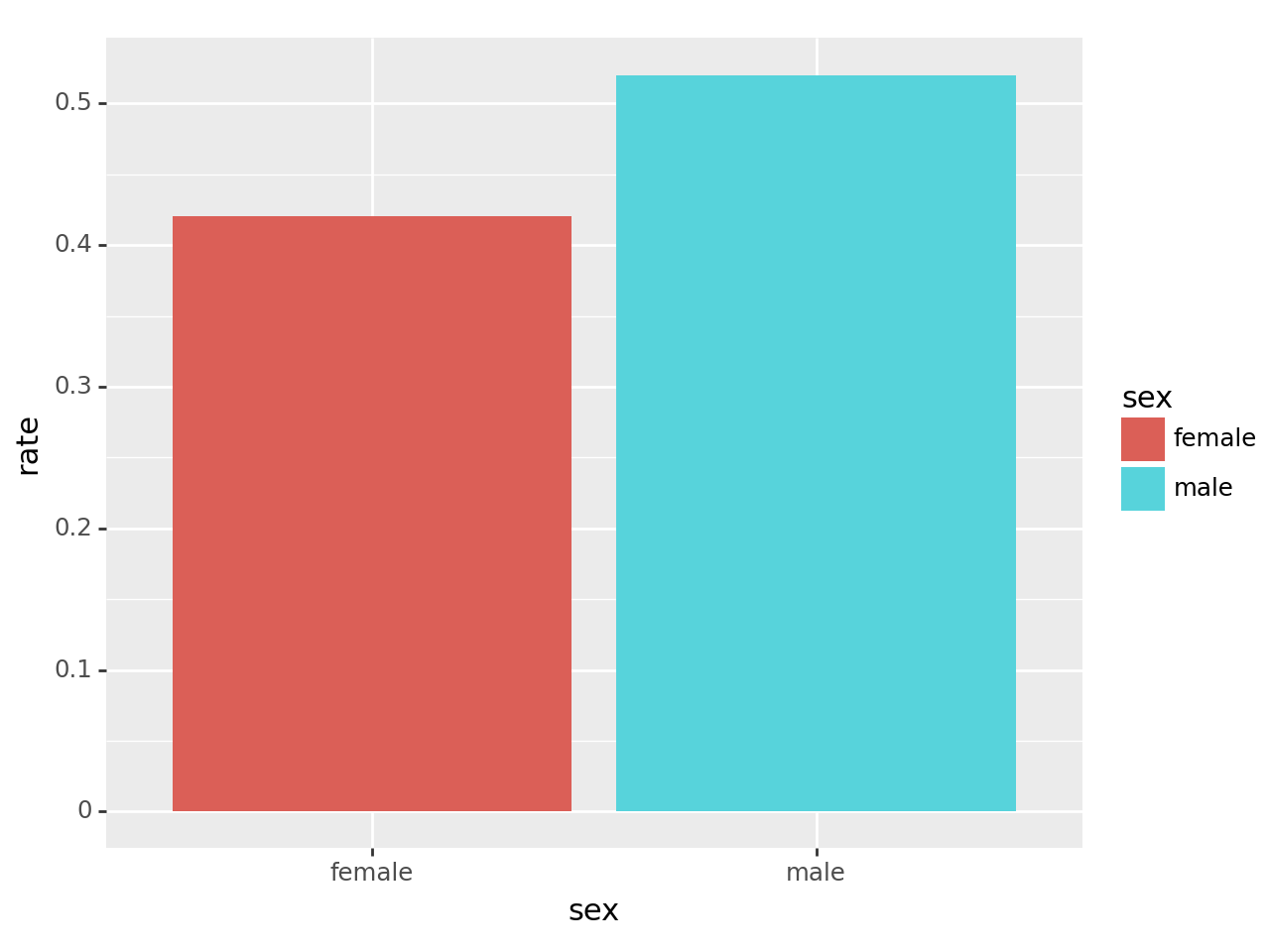
B. 시각화1: 전체합격률 시각화 – pandas 고수
df.pivot_table(index='gender', columns='result', values='count', aggfunc=sum)/tmp/ipykernel_3693597/1414298521.py:1: FutureWarning: The provided callable <built-in function sum> is currently using DataFrameGroupBy.sum. In a future version of pandas, the provided callable will be used directly. To keep current behavior pass the string "sum" instead.| result | fail | pass |
|---|---|---|
| gender | ||
| female | 1063 | 772 |
| male | 1291 | 1400 |
df.pivot_table(index='gender', columns='result', values='count', aggfunc=sum)\
.assign(rate = lambda _df: _df['pass'] / (_df['fail'] + _df['pass']))\
.reset_index()
/tmp/ipykernel_3693597/3036569198.py:1: FutureWarning: The provided callable <built-in function sum> is currently using DataFrameGroupBy.sum. In a future version of pandas, the provided callable will be used directly. To keep current behavior pass the string "sum" instead.| result | gender | fail | pass | rate |
|---|---|---|---|---|
| 0 | female | 1063 | 772 | 0.420708 |
| 1 | male | 1291 | 1400 | 0.520253 |
tidydata = df.pivot_table(index='gender', columns='result', values='count', aggfunc=sum)\
.assign(rate = lambda _df: _df['pass'] / (_df['fail'] + _df['pass']))\
.reset_index()

fig = ggplot(tidydata)
col = geom_col(aes(x='gender',y='rate',fill='gender'))
fig + col
/tmp/ipykernel_3693597/1840989269.py:1: FutureWarning: The provided callable <built-in function sum> is currently using DataFrameGroupBy.sum. In a future version of pandas, the provided callable will be used directly. To keep current behavior pass the string "sum" instead.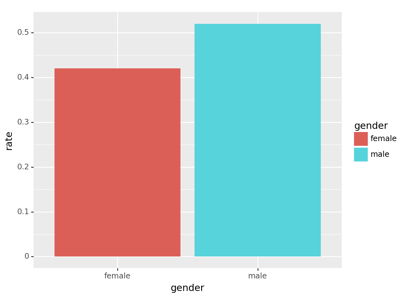
5. HW
적당한 데이터프레임을 선언하고 아래와 같은 barplot을 그려라.
#