라인플랏, 산점도, 여러 그림 그리기, fig와 axes의 이해
강의영상
https://youtube.com/playlist?list=PLQqh36zP38-xX1bzyd7pHlAlCcX3mzja2
오늘 배울 내용?
- 라인플랏과 산점도를 그리는 방법
- 여러 그림그리기 (한 플랏에 그림을 겹치는 방법, subplot을 그리는 방법)
- fig, axes의 개념이해 (객체지향적 프로그래밍)
imports
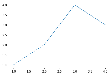
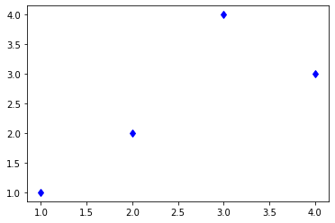
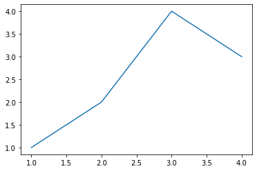
Line plot
기본플랏
- 예시1

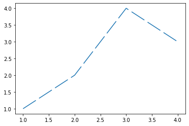
모양변경
- 예시1

- 예시2

- 예시3
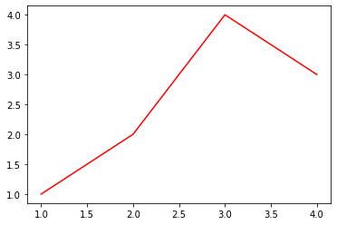
색상변경
- 예시1
- 예시2

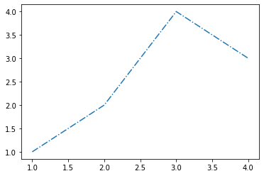
모양 + 색상변경
- 예시1

- 예시2: 순서변경 가능

원리?
- r--등의 옵션은 Markers + Line Styles + Colors 의 조합으로 표현가능
ref: https://matplotlib.org/stable/api/_as_gen/matplotlib.pyplot.plot.html
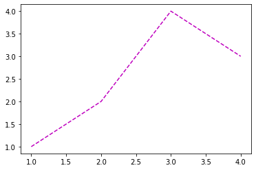
--r: 점선(dashed)스타일 + 빨간색r--: 빨간색 + 점선(dashed)스타일:k: 점선(dotted)스타일 + 검은색k:: 검은색 + 점선(dotted)스타일
- 우선 Marker를 무시하면 Line Styles + Color로 표현가능한 조합은 \(4\times 8=32\) 개
(Line Styles) 모두 4개
| character | description |
|---|---|
| ‘-’ | solid line style |
| ‘–’ | dashed line style |
| ‘-.’ | dash-dot line style |
| ‘:’ | dotted line style |
(Color) 모두 8개
| character | color |
|---|---|
| ‘b’ | blue |
| ‘g’ | green |
| ‘r’ | red |
| ‘c’ | cyan |
| ‘m’ | magenta |
| ‘y’ | yellow |
| ‘k’ | black |
| ‘w’ | white |
- 예시1
- 예시2
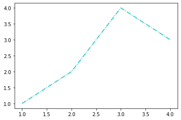
- 예시3: line style + color 조합으로 사용하든 color + line style 조합으로 사용하든 상관없음


- 예시4: line style을 중복으로 사용하거나 color를 중복으로 쓸 수 는 없다.

- 예시5: 색이 사실 8개만 있는건 아니다.
ref: https://matplotlib.org/2.0.2/examples/color/named_colors.html

- 예시6: 색을 바꾸려면 Hex코드를 밖아 넣는 방법이 젤 깔끔함
ref: https://htmlcolorcodes.com/
- 예시7: 당연히 라인스타일도 4개만 있진 않겠지
ref: https://matplotlib.org/stable/gallery/lines_bars_and_markers/linestyles.html
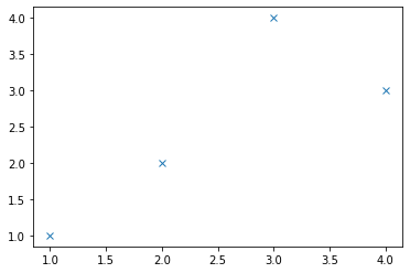
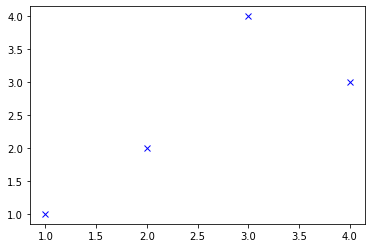
Scatter plot
원리
- 그냥 마커를 설정하면 끝!
ref: https://matplotlib.org/stable/api/_as_gen/matplotlib.pyplot.plot.html
| character | description |
|---|---|
| ‘.’ | point marker |
| ‘,’ | pixel marker |
| ‘o’ | circle marker |
| ‘v’ | triangle_down marker |
| ‘^’ | triangle_up marker |
| ‘<’ | triangle_left marker |
| ‘>’ | triangle_right marker |
| ‘1’ | tri_down marker |
| ‘2’ | tri_up marker |
| ‘3’ | tri_left marker |
| ‘4’ | tri_right marker |
| ‘8’ | octagon marker |
| ‘s’ | square marker |
| ‘p’ | pentagon marker |
| ‘P’ | plus (filled) marker |
| ’*’ | star marker |
| ‘h’ | hexagon1 marker |
| ‘H’ | hexagon2 marker |
| ‘+’ | plus marker |
| ‘x’ | x marker |
| ‘X’ | x (filled) marker |
| ‘D’ | diamond marker |
| ‘d’ | thin_diamond marker |
| ‘|’ | vline marker |
| ’_’ | hline marker |

기본플랏
- 예시1

- 예시2
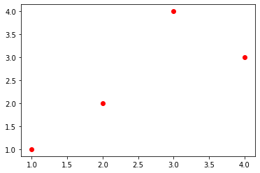
색깔변경
- 예시1
- 예시2
- 예시3
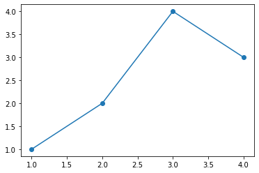
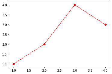
dot-connected plot
- 예시1: 마커와 라인스타일을 동시에 사용하면 dot-connected plot이 된다.
- 예시2: 당연히 색도 적용가능함

- 예시3: 서로 순서를 바꿔도 상관없다.

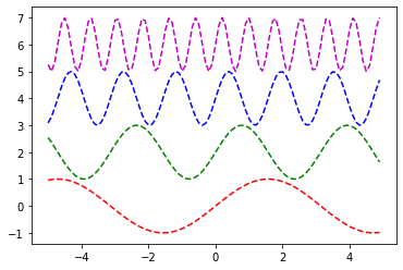
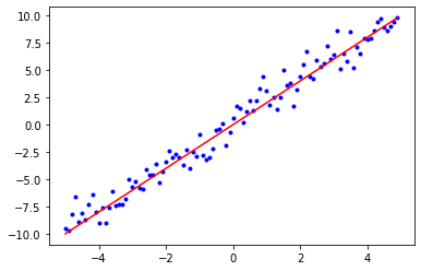
여러 그림 그리기
겹쳐그리기
- 예시1
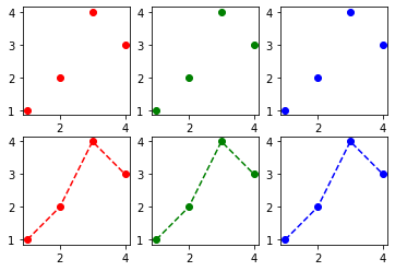
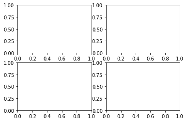
따로그리기 (subplot) // 외우세요 이거
- 예시1
- 예시2

fig와 axes의 이해 : matplotlib으로 어렵게 그림을 그리는 방법
예제1
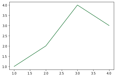
- 목표: plt.plot()을 이용하지 않고 아래의 그림을 그려보자.
- 구조: axis \(\subset\) axes \(\subset\) figure
ref: https://matplotlib.org/stable/gallery/showcase/anatomy.html#sphx-glr-gallery-showcase-anatomy-py
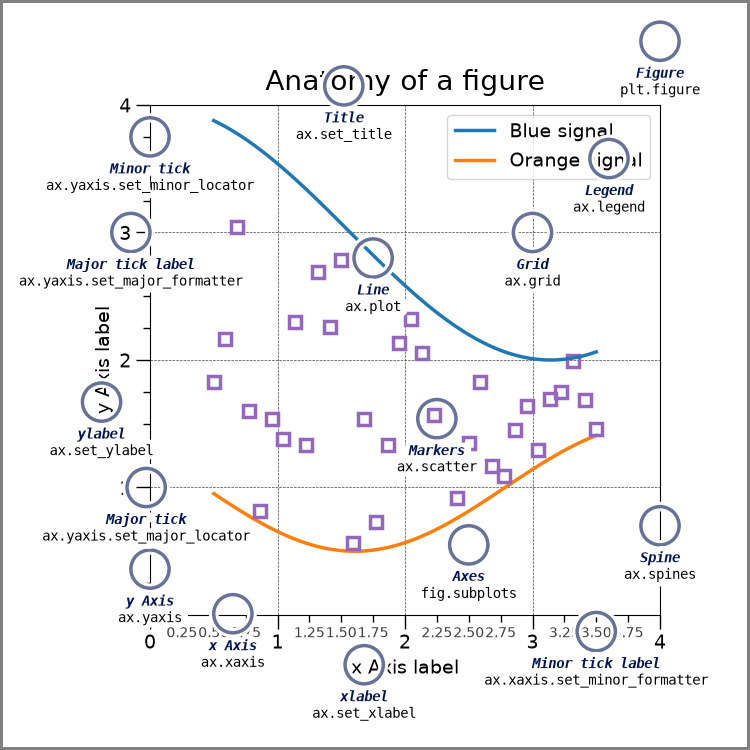
- 전략: Fig을 만들고 (도화지를 준비) \(\to\) axes를 만들고 (네모틀) \(\to\) axes에 그림을 그린다.
- 그림객체를 생성한다.
- 그림객체에는 여러 인스턴스 + 함수가 있는데 그중에서 axes도 있다. (그런데 그와중에 plot method는 없다)
- axes 추가

- 첫번째 액시즈를 ax1로 받음 (원래 axes1이어야하는데 그냥 편의상)
- 잠깐만! (fig 오브젝트와 ax1 오브젝트는 포함관계에 있다)
- 또 잠깐만! (fig 오브젝트에는 plot이 없지만 ax1 오브젝트에는 plot이 있다)
- ax1.plot()을 사용하여 그림을 그려보자.
예제2: 예제1의 응용
- 예제1상황

- 여기서 축을 하나 더 추가할거에요

- ax2에 파란선으로 그림을 그리자.
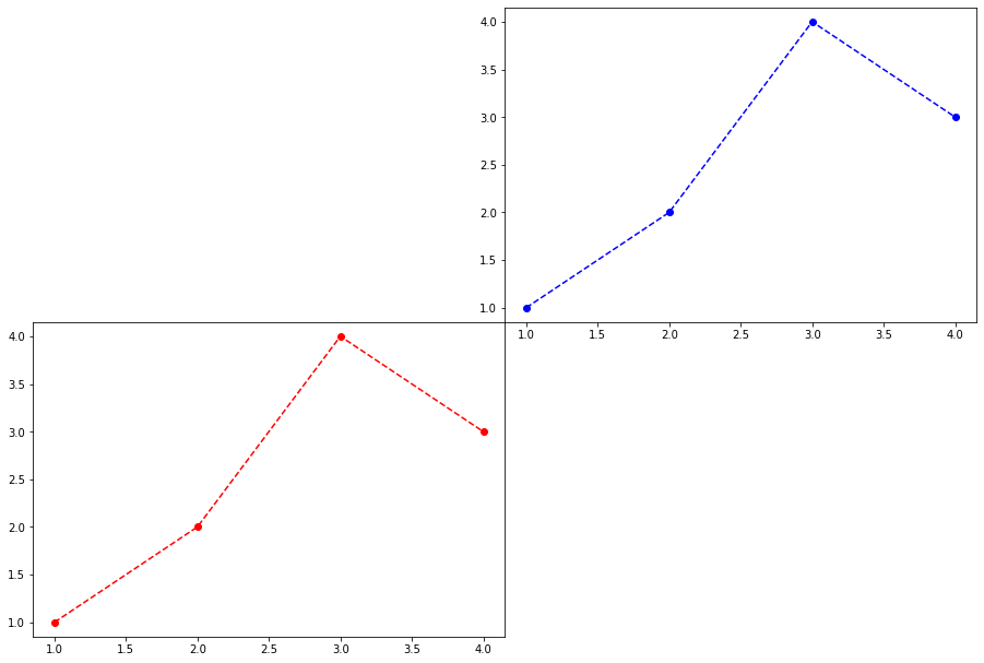
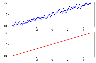
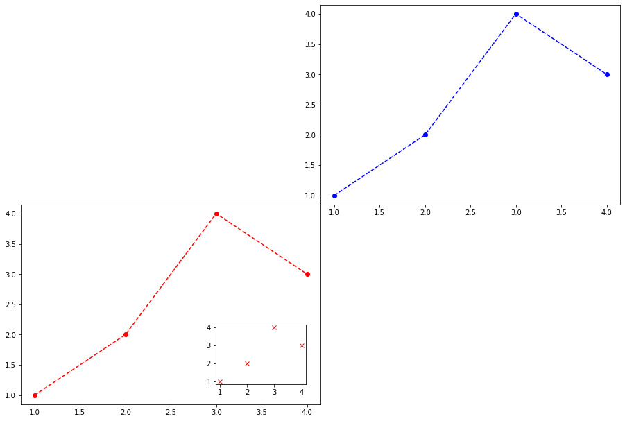
예제3: 더 응용! (미니맵)
- 지금 상황

- 액시즈를 하나 더 추가

예제4: 재해석1
(ver1)
(ver2)
ver1은 사실 아래가 연속적으로 실행된 축약구문임
예제5: 재해석2
- 아래의 코드도 재해석하자.
fig, axs = plt.subplots(2,2)
axs[0,0].plot([1,2,3,4],[1,2,4,3],'.')
axs[0,1].plot([1,2,3,4],[1,2,4,3],'--r')
axs[1,0].plot([1,2,3,4],[1,2,4,3],'o--')
axs[1,1].plot([1,2,3,4],[1,2,4,3],'o--',color='lime')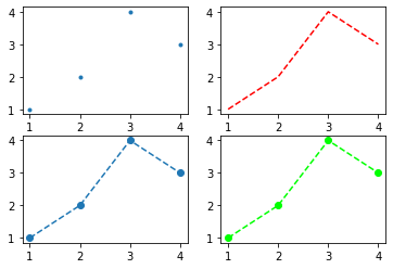
- fig, axs = plt.subplots(2,2)의 축약버전을 이해하면된다.
(ver1)

(ver2)
ver1은 사실 아래의 축약!
fig = plt.figure()
fig.add_axes([?,?,?,?])
fig.add_axes([?,?,?,?])
fig.add_axes([?,?,?,?])
fig.add_axes([?,?,?,?])
ax1,ax2,ax3,ax4 = fig.axes
axs = np.array(((ax1,ax2),(ax3,ax4)))
(ver3)
ver1은 아래와 같이 표현할 수도 있다.

HW
제출: 이름(학번).ipynb, 이름(학번).html 형태로 정리하여 2개의 파일을 제출할 것 (작성방법 모르면 아래영상참고할것) - 즉 주피터노트북파일과 html파일을 모두 제출할 것
https://youtube.com/playlist?list=PLQqh36zP38-x3HQLeyrS7GLh70Dv_54Yg
- 영상1: 코랩으로 실습하는 경우
- 영상2: local 아나콘다로 실습하는 경우