import matplotlib.pyplot as plt
import numpy as np
import matplotlib
matplotlib.rcParams['figure.figsize'] = (3, 2)
matplotlib.rcParams['figure.dpi'] = 15002wk-1: 객체지향적 시각화 (2), Subplot, 산점도 응용예제 1-2
matplotlib
![]()
1. 강의영상
2. Imports
3. 객체지향적 시각화 (2)
A. 예비학습
# 예비학습1 – 그림을 저장했다가 꺼내보고 싶다.
- 그림을 그리고 저장하자.
plt.plot([1,2,4,3])
fig = plt.gcf()
- 다른그림을 그려보자.
plt.plot([1,2,4,3],'--o')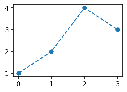
- 저장한 그림은 언제든지 꺼내볼 수 있음
fig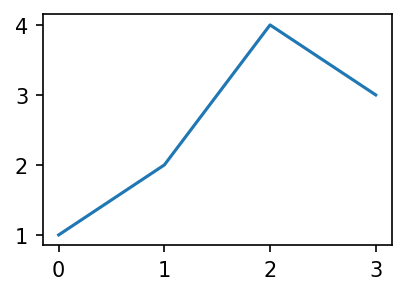
#
# 예비학습2 – fig 는 뭐야?
#fig??
type(fig)matplotlib.figure.FigureFigure라는 클래스에서 찍힌 인스턴스
- 여러가지 값, 기능이 저장되어 있겠음.
fig.axes[<Axes: >]ax = fig.axes[0]yaxis= ax.yaxis
xaxis= ax.xaxislines = ax.get_lines()
line = lines[0]- 계층구조: Figure \(\supset\) [Axes,…] \(\supset\) YAxis, XAxis, [Line2D,…]
type(fig)matplotlib.figure.Figure1. .axes 로 Axes 를 끄집어냄
ax = fig.axes[0]
type(ax)matplotlib.axes._axes.Axes2. .xaxis, .yaxis 로 Axis 를 끄집어냄
yaxis = ax.yaxis
xaxis = ax.xaxis
type(yaxis), type(xaxis)
(matplotlib.axis.YAxis, matplotlib.axis.XAxis)3. .get_lines()로 Line2D를 끄집어냄
lines = ax.get_lines()
line=lines[0]
type(line)matplotlib.lines.Line2D- 오브젝트내용 확인 (그닥 필요 없음)
line.properties()['data'](array([0., 1., 2., 3.]), array([1, 2, 4, 3]))- matplotlib의 설명
ref: https://matplotlib.org/stable/gallery/showcase/anatomy.html#sphx-glr-gallery-showcase-anatomy-py
B. plt.plot 쓰지 않고 그림그리기
- 개념:
- Figure(fig): 도화지
- Axes(ax): 도화지에 존재하는 그림틀
- Axis, Lines: 그림틀 위에 올려지는 물체(object)
- 목표: 아래와 똑같은 그림을 plt.plot()을 쓰지 않고 만든다.
plt.plot([1,2,3,2],'--o')
- 아래와 같이 하면 된다.
fig = plt.Figure()
ax = fig.add_axes([0.125, 0.11, 0.775, 0.77])
ax.set_xlim([-0.15, 3.15])
ax.set_ylim([0.9, 3.1])
line = matplotlib.lines.Line2D(
    xdata=[0,1,2,3],
    ydata=[1,2,3,2],
    linestyle='--',
    marker='o'
)
ax.add_line(line)
fig
Figure
fig = plt.Figure() - 클래스를 모른다면:
plt.Figure()는 도화지를 만드는 함수라 생각할 수 있음 - 클래스문법에 익숙하다면: 이 과정은 사실 클래스 -> 인스턴스의 과정임 (
plt라는 모듈안에Figure라는 클래스가 있는데, 그 클래스에서 인스턴스를 만드는 과정임)
fig<Figure size 450x300 with 0 Axes>- 아직은 아무것도 없음
Axes
ax = fig.add_axes([0.125, 0.11, 0.775, 0.77])fig.add_axes는 fig에 소속된 함수이며, 도화지에서 그림틀을 ‘추가하는’ 함수이다.
fig
- 이제 fig라는 이름의 도화지에는 추가된 그림틀이 보인다.
Axes 조정
ax.set_xlim([-0.15, 3.15])
ax.set_ylim([0.9, 3.1])
(0.9, 3.1)fig
Lines
line = matplotlib.lines.Line2D(
    xdata=[0,1,2,3],
    ydata=[1,2,3,2],
    linestyle='--',
    marker='o'
)ax.add_line(line)fig
fig
다른방법들
- 조금 다른 방법: Line2d 오브젝트를 쓰지 않는 방법
fig = plt.Figure()
ax = fig.add_axes([0.125, 0.11, 0.775, 0.77])
ax.plot([1,2,3,2],'--o')
fig
- 조금 다른 방법 (2): add_axes()를 쓰지 않는 방법
fig = plt.Figure()
ax = fig.subplots(1)
ax.plot([1,2,3,2],'--o')
fig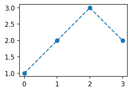
- 좀 더 다른 방법 (3)
fig, ax = plt.subplots(1)
ax.plot([1,2,3,2],'--o')
C. 정리 (\(\star\star\star\))
- 결국 아래는 모두 같은 코드이다.
## 코드1
plt.plot([1,2,3,2],'--o')
## 코드2
fig,ax = plt.subplots()
ax.plot([1,2,3,2],'--o')
## 코드3
fig = plt.Figure()
ax = fig.subplots()
ax.plot([1,2,3,2],'--o')
fig
## 코드4
fig = plt.Figure()
ax = fig.add_axes([0.125, 0.11, 0.775, 0.77])
ax.plot([1,2,3,2],'--o')
fig
## 코드5
fig = plt.Figure()
ax = fig.add_axes([0.125, 0.11, 0.775, 0.77])
ax.set_xlim([-0.15, 3.15])
ax.set_ylim([0.9, 3.1])
line = matplotlib.lines.Line2D(
    xdata=[0,1,2,3],
    ydata=[1,2,3,2],
    linestyle='--',
    marker='o'
)
ax.add_line(line)
fig
D. 미니맵
- 틀잡기
fig = plt.Figure()
ax = fig.add_axes([0,0,2,2])
ax_mini = fig.add_axes([1.4,0.2,0.5,0.5])
fig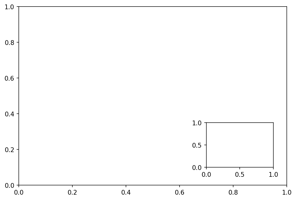
ax.plot([1,5,3,4],'--o')
ax_mini.plot([1,2,3,1],'--or')
fig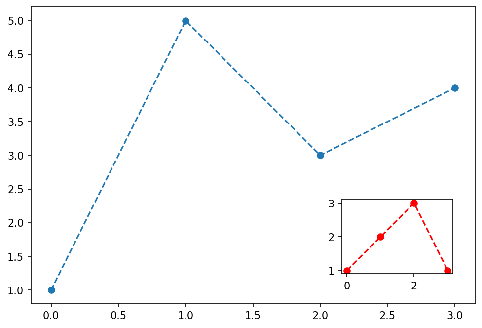
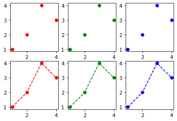
4. Subplot
A. plt.subplots()
- 예시1
# fig, axs = plt.subplots(2)
fig, (ax1,ax2) = plt.subplots(2,figsize=(4,4))
ax1.plot([1,2,3,2],'--r')
ax2.plot([1,2,4,3],'--o')
fig.tight_layout()
# plt.tight_layout()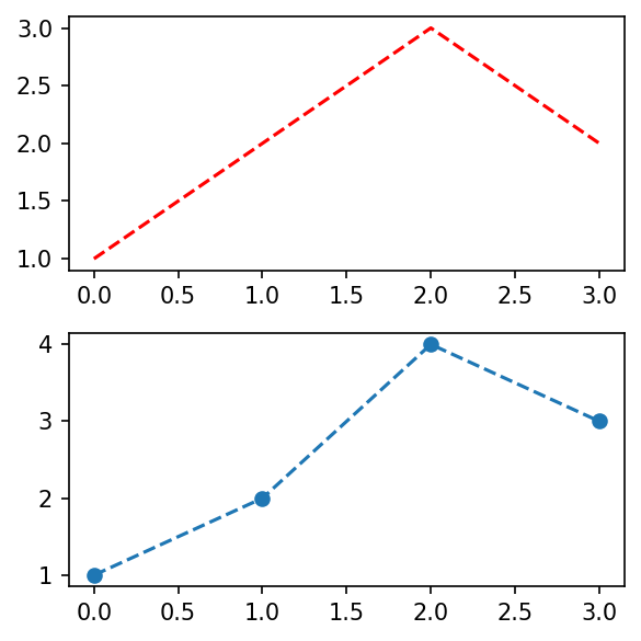
- 예시2
fig, ((ax1,ax2),(ax3,ax4)) = plt.subplots(2,2, figsize=(4,4))
ax1.plot([1,2,4,3],'o', color='C0')
ax2.plot([1,2,4,3],'o', color='C1')
ax3.plot([1,2,4,3],'o', color='C2')
ax4.plot([1,2,4,3],'o', color='C3')
fig.tight_layout()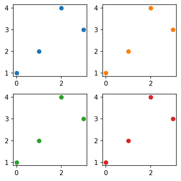
B. plt.subplot()
- 예시1
plt.figure(figsize=(4,4))
plt.subplot(2,2,1)
plt.plot([1,2,4,3],'o', color='C0')
plt.subplot(2,2,2)
plt.plot([1,2,4,3],'o', color='C1')
plt.subplot(2,2,3)
plt.plot([1,2,4,3],'o', color='C2')
plt.subplot(2,2,4)
plt.plot([1,2,4,3],'o', color='C3')
plt.tight_layout()
5. Title
- title을 만드는 함수는 어떤 오브젝트에 소속되는게 좋을까?
pltfigax
A. 일반적인 플랏
plt
plt.plot([1,2,3,2])
plt.title('asdf')
Text(0.5, 1.0, 'asdf')
plt.title??Signature: plt.title(label, fontdict=None, loc=None, pad=None, *, y=None, **kwargs) Docstring: Set a title for the Axes. Set one of the three available Axes titles. The available titles are positioned above the Axes in the center, flush with the left edge, and flush with the right edge. Parameters ---------- label : str Text to use for the title fontdict : dict A dictionary controlling the appearance of the title text, the default *fontdict* is:: {'fontsize': rcParams['axes.titlesize'], 'fontweight': rcParams['axes.titleweight'], 'color': rcParams['axes.titlecolor'], 'verticalalignment': 'baseline', 'horizontalalignment': loc} loc : {'center', 'left', 'right'}, default: :rc:`axes.titlelocation` Which title to set. y : float, default: :rc:`axes.titley` Vertical Axes location for the title (1.0 is the top). If None (the default) and :rc:`axes.titley` is also None, y is determined automatically to avoid decorators on the Axes. pad : float, default: :rc:`axes.titlepad` The offset of the title from the top of the Axes, in points. Returns ------- `.Text` The matplotlib text instance representing the title Other Parameters ---------------- **kwargs : `~matplotlib.text.Text` properties Other keyword arguments are text properties, see `.Text` for a list of valid text properties. Source: @_copy_docstring_and_deprecators(Axes.set_title) def title(label, fontdict=None, loc=None, pad=None, *, y=None, **kwargs): return gca().set_title( label, fontdict=fontdict, loc=loc, pad=pad, y=y, **kwargs) File: ~/anaconda3/envs/mp/lib/python3.10/site-packages/matplotlib/pyplot.py Type: function
fig – 원래는 불가능
plt.plot([1,2,3,2])
fig = plt.gcf()
fig.suptitle("asdf")
Text(0.5, 0.98, 'asdf')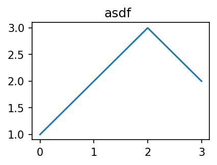
ax
plt.plot([1,2,3,2])
ax = plt.gca()
ax.set_title("asdf")
Text(0.5, 1.0, 'asdf')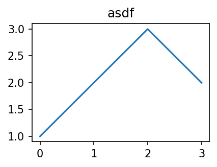
B. 서브플랏
ax
fig,(ax1,ax2) = plt.subplots(1,2)
ax1.set_title('asdf')
ax2.set_title('1234')
fig.tight_layout()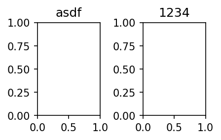
plt
plt.subplot(121)
plt.plot([1,2,3])
plt.title('asdf')
plt.subplot(122)
plt.plot([1,2,1])
plt.title('1234')
plt.tight_layout()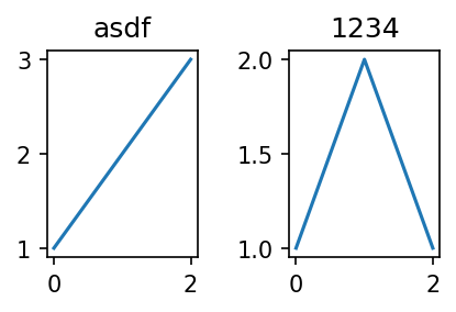
fig
fig,(ax1,ax2) = plt.subplots(1,2)
ax1.set_title('asdf')
ax2.set_title('1234')
fig.suptitle('asdf1234')
fig.tight_layout()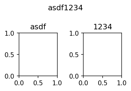
6. 산점도 응용예제1 – 표본상관계수
A. motivating EX
# 예제 – 키와 몸무게의 산점도
- 아래와 같은 자료를 수집하였다고 하자.
- 몸무게 = [44,48,49,58,62,68,69,70,76,79]
- 키 = [159,160,162,165,167,162,165,175,165,172]
x=[44,48,49,58,62,68,69,70,76,79]
y=[159,160,162,165,167,162,165,175,165,172]plt.plot(x,y,'o')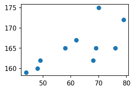
- 키가 큰 사람일수록 몸무게도 많이 나간다. (반대도 성립)
- 키와 몸무게는 관계가 있어보인다. (정비례)
- 얼만큼 정비례인지?
- 이 질문에 대답하기 위해서는 상관계수의 개념을 알아야 한다.
- 상관계수는 산점도의 해석에서 가장 중요한 개념 중 하나.
#
B. 예비학습 – 상관계수
# 예제 – 키와 몸무게에서 상관계수
- 다시 아래의 자료를 고려하자.
x=[44,48,49,58,62,68,69,70,76,79]
y=[159,160,162,165,167,162,165,175,165,172]
- (표본)상관계수
\[r=\frac{\sum_{i=1}^{n}(x_i-\bar{x})(y_i-\bar{y}) }{\sqrt{\sum_{i=1}^{n}(x_i-\bar{x})^2\sum_{i=1}^{n}(y_i-\bar{y})^2 }}=\sum_{i=1}^{n}\tilde{x}_i\tilde{y}_i \]
- 단, \(\tilde{x}_i=\frac{(x_i-\bar{x})}{\sqrt{\sum_{i=1}^n(x_i-\bar{x})^2}}\), \(\tilde{y}_i=\frac{(y_i-\bar{y})}{\sqrt{\sum_{i=1}^n(y_i-\bar{y})^2}}\)
- 상관계수를 계산하는 방법
(원래자료)
x,y([44, 48, 49, 58, 62, 68, 69, 70, 76, 79],
[159, 160, 162, 165, 167, 162, 165, 175, 165, 172])(평균을 0으로)
xx = x-np.mean(x)
yy = y-np.mean(y)
(퍼진정도를 표준화)
xxx = xx/np.sqrt(np.sum(xx**2))
yyy = yy/np.sqrt(np.sum(yy**2))(xxx*yyy).sum()0.7138620583559141- 상관계수를 계산하는 방법2
np.corrcoef(x,y)array([[1. , 0.71386206],
[0.71386206, 1. ]])- 상관계수의 성질: 절대값이 1보다 작다.
#
C. 산점도를 보고 상관계수의 부호를 해석
# 예제 – 키와 몸무게의 산점도 + 상관계수의 부호해석
- 질문: 아래의 그림은 상관계수 \(r\)의 값이 양수인가 음수인가?
x=[44,48,49,58,62,68,69,70,76,79]
y=[159,160,162,165,167,162,165,175,165,172]plt.plot(x,y,'o')
- 차근차근 따져보자.
xx = x-np.mean(x)
yy = y-np.mean(y)
xxx = xx/np.sqrt(np.sum(xx**2))
yyy = yy/np.sqrt(np.sum(yy**2))
fig, (ax1,ax2,ax3) = plt.subplots(1,3,figsize=(10,3))
ax1.plot(x,y,'o'); ax1.set_title(r'$(x_i,y_i)$')
ax2.plot(xx,yy,'o'); ax2.set_title(r'$(x_i-\bar{x},y_i-\bar{y})$')
ax3.plot(xxx,yyy,'o'); ax3.set_title(r'$(\tilde{x}_i,\tilde{y}_i)$')Text(0.5, 1.0, '$(\\tilde{x}_i,\\tilde{y}_i)$')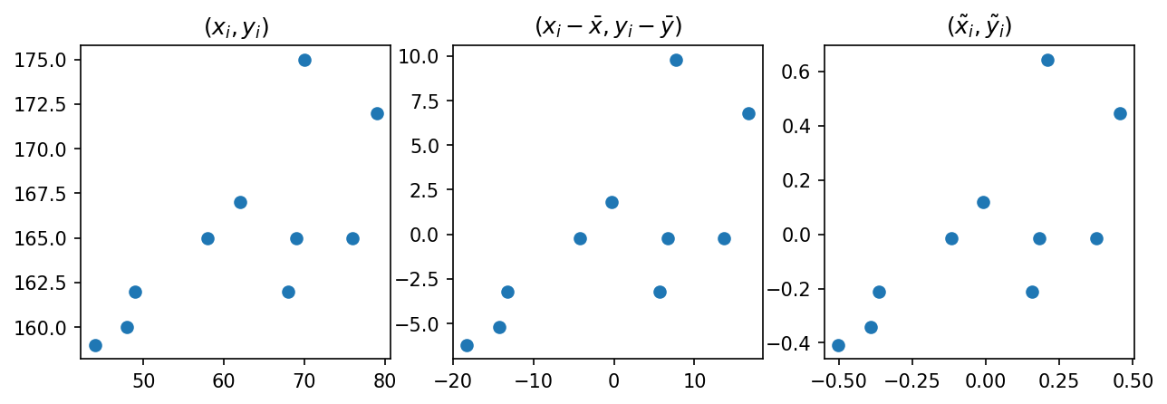
- \(\tilde{x}_i\), \(\tilde{y}_i\) 를 곱한값이 양수인것과 음수인것을 체크해보자.
- 양수인쪽이 많은지 음수인쪽이 많은지 생각해보자.
- \(r=\sum_{i=1}^{n}\tilde{x}_i \tilde{y}_i\) 의 부호는?
- 그림을 보고 상관계수의 부호를 알아내는 방법? \((x_i,y_i)\)의 산점도를 보고 \((\tilde{x}_i, \tilde{y}_i)\) 의 산점도를 상상 \(\to\) 1,3 분면에 점들이 많으면 양수, 2,4 분면에 점들이 많으면 음수
#
D. 산점도를 보고 상관계수의 절대값을 해석
# 예제 – 기울기가 동일, 그렇지만 직선근처의 퍼짐이 다른 경우
- 자료가 아래와 같다고 하자.
x=np.arange(0,10,0.1)
y1=x+np.random.normal(loc=0,scale=1.0,size=len(x))
y2=x+np.random.normal(loc=0,scale=7.0,size=len(x))plt.plot(x,y1,'.')
plt.plot(x,y2,'x')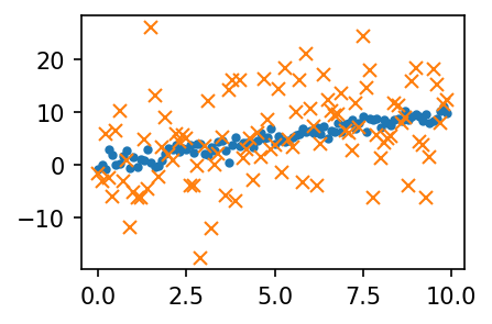
- \((x_i,y_i)\)의 그래프와 \((\tilde{x}_i,\tilde{y}_i)\)의 그래프를 그려보자.
def tilde(x):
    xx = x-np.mean(x)
    xxx = xx / np.sqrt(np.sum(xx**2))
    return xxx
fig, (ax1,ax2) = plt.subplots(1,2,figsize=(4,2))
ax1.plot(x,y1,'.'); ax1.plot(x,y2,'x'); ax1.set_title(r'$(x_i,y_i)$')
ax2.plot(tilde(x),tilde(y1),'.'); ax2.plot(tilde(x),tilde(y2),'x'); ax2.set_title(r'$(\tilde{x}_i,\tilde{y}_i)$')
fig.tight_layout()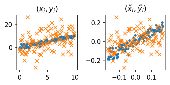
#
# 예제2 – 직선근처의 퍼짐은 동일하지만, 직선의 기울기가 다른 경우
- 자료가 아래와 같다고 하자.
x=np.arange(0,10,0.1)
y1=x+np.random.normal(loc=0,scale=1.0,size=len(x))
y2=0.2*x+np.random.normal(loc=0,scale=1.0,size=len(x))plt.plot(x,y1,'.')
plt.plot(x,y2,'x')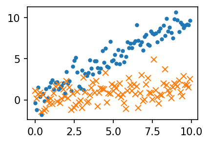
- \((x_i,y_i)\)의 그래프와 \((\tilde{x}_i,\tilde{y}_i)\)의 그래프를 그려보자.
def tilde(x):
    xx = x-np.mean(x)
    xxx = xx / np.sqrt(np.sum(xx**2))
    return xxx
fig, (ax1,ax2) = plt.subplots(1,2,figsize=(4,2))
ax1.plot(x,y1,'.'); ax1.plot(x,y2,'x'); ax1.set_title(r'$(x_i,y_i)$')
ax2.plot(tilde(x),tilde(y1),'.'); ax2.plot(tilde(x),tilde(y2),'x'); ax2.set_title(r'$(\tilde{x}_i,\tilde{y}_i)$')
fig.tight_layout()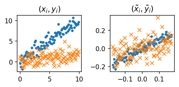
#
7. 산점도 응용예제2 – 앤스콤의 4분할
- Anscombe’s quartet: 교과서에 나오는 그림임.
x1 = [10, 8, 13, 9, 11, 14, 6, 4, 12, 7, 5]
y1 = [8.04, 6.95, 7.58, 8.81, 8.33, 9.96, 7.24, 4.26, 10.84, 4.82, 5.68]

x2 = x1
y2 = [9.14, 8.14, 8.74, 8.77, 9.26, 8.10, 6.13, 3.10, 9.13, 7.26, 4.74]

x3 = x1
y3 = [7.46, 6.77, 12.74, 7.11, 7.81, 8.84, 6.08, 5.39, 8.15, 6.42, 5.73]

x4 = [8, 8, 8, 8, 8, 8, 8, 19, 8, 8, 8]
y4 = [6.58, 5.76, 7.71, 8.84, 8.47, 7.04, 5.25, 12.50, 5.56, 7.91, 6.89]
- corr coef 체크
np.corrcoef([x1,y1]),np.corrcoef([x2,y2]),np.corrcoef([x3,y3]),np.corrcoef([x4,y4])(array([[1. , 0.81642052],
[0.81642052, 1. ]]),
array([[1. , 0.81623651],
[0.81623651, 1. ]]),
array([[1. , 0.81628674],
[0.81628674, 1. ]]),
array([[1. , 0.81652144],
[0.81652144, 1. ]]))- 모두 0.816..
- 교훈1: 데이터를 분석하기 전에 항상 시각화를 하라.
fig, ((ax1,ax2),(ax3,ax4)) = plt.subplots(2,2,figsize=(6,4))
ax1.plot(x1,y1,'o'); ax1.set_title('corrcoef= 0.81642052')
ax2.plot(x2,y2,'o'); ax2.set_title('corrcoef= 0.81623651')
ax3.plot(x3,y3,'o'); ax3.set_title('corrcoef= 0.81628674')
ax4.plot(x4,y4,'o'); ax4.set_title('corrcoef= 0.81652144')
fig.tight_layout()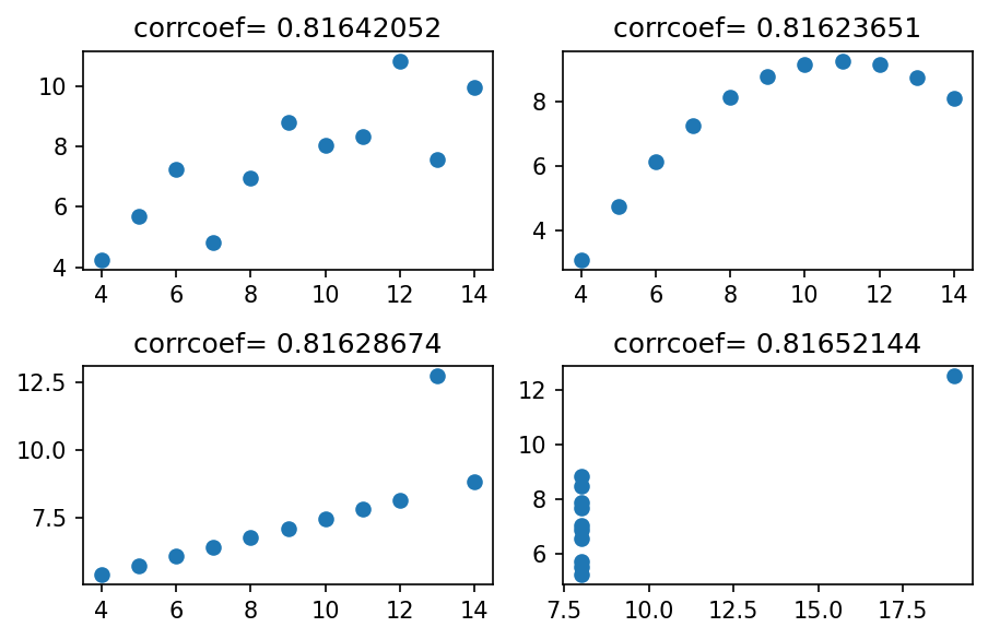
- 앤스콤플랏의 4개의 그림은 모두 같은 상관계수를 가진다. \(\to\) 하지만 4개의 그림은 느낌이 전혀 다르다.
- 같은 표본상관계수를 가진다고 하여 같은 관계성을 가지는 것은 아니다. 표본상관계수는 x,y의 비례정도를 측정하는데 그 값이 1에 가깝다고 하여 꼭 정비례의 관계가 있음을 의미하는게 아니다. \((x_i,y_i)\)의 산점도가 선형성을 보일때만 “표본상관계수가 1에 가까우므로 정비례의 관계에 있다” 라는 논리전개가 성립한다.
- 앤스콤의 1번째 플랏: 산점도가 선형 \(\to\) 표본상관계수가 0.816 = 정비례의 관계가 0.816 정도
- 앤스콤의 2번째 플랏: 산점도가 선형이 아님 \(\to\) 표본상관계수가 크게 의미없음
- 앤스콤의 3번째 플랏: 산점도가 선형인듯 보이나 하나의 이상치가 있음 \(\to\) 하나의 이상치가 표본상관계수의 값을 무너뜨릴 수 있으므로 표본상관계수값을 신뢰할 수 없음.
- 앤스콤의 4번째 플랏: 산점도를 그려보니 이상한 그림 \(\to\) 표존상관계수를 계산할수는 있음. 그런데 그게 무슨 의미가 있을지?
# 예제 – 하나의 이상치가 상관계수를 무너뜨리는 경우
- 아래와 같이 앤스콤의 첫번째 플랏을 다시 그려보자.
plt.plot(x1,y1,'x')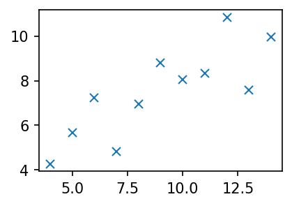
- 하나의 점을 추가하여 이 상관계수 값을 -1에 가깝게 만들 수 있다.
plt.plot(x1+[99],y1+[-99],'x')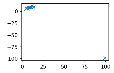
Exception ignored in atexit callback: <bound method InteractiveShell.atexit_operations of <ipykernel.zmqshell.ZMQInteractiveShell object at 0x7f195d0b92d0>>
Traceback (most recent call last):
  File "/home/cgb2/anaconda3/envs/torch/lib/python3.11/site-packages/IPython/core/interactiveshell.py", line 3875, in atexit_operations
    self._atexit_once()
  File "/home/cgb2/anaconda3/envs/torch/lib/python3.11/site-packages/IPython/core/interactiveshell.py", line 3854, in _atexit_once
    self.reset(new_session=False)
  File "/home/cgb2/anaconda3/envs/torch/lib/python3.11/site-packages/IPython/core/interactiveshell.py", line 1373, in reset
    self.history_manager.reset(new_session)
  File "/home/cgb2/anaconda3/envs/torch/lib/python3.11/site-packages/IPython/core/history.py", line 597, in reset
    self.dir_hist[:] = [Path.cwd()]
                        ^^^^^^^^^^
  File "/home/cgb2/anaconda3/envs/torch/lib/python3.11/pathlib.py", line 907, in cwd
    return cls(os.getcwd())
               ^^^^^^^^^^^
FileNotFoundError: [Errno 2] No such file or directorynp.corrcoef(x1+[99],y1+[-99])array([[ 1. , -0.98450679],
[-0.98450679, 1. ]])#
- 교훈2: 상관계수를 해석하기에 앞서서 산점도가 선형성을 보이는지 체크할 것! 항상 통계학과에서 배우는 통계량 (혹은 논리전개)는 적절한 가정하에서만 말이된다는 사실을 기억할 것!
9. HW
1. 아래와 같은 그림을 그려라.
x,y = [1,2,3,4], [1,2,4,3] #